an honest comparison
The best React icon library in 2026: 10 libraries, compared
lucide-react, react-icons, Heroicons, Phosphor, Tabler, MUI and more, side by side: how many icons you get, how you import them, how they behave in Next.js, and which one suits your app.
- Best default for most React apps: lucide-react. Over 2,000 clean outline icons, ISC licence, typed, tree-shakable, and the default in shadcn/ui.
- Most free MIT icons: Tabler (over 6,200, with filled versions of over 1,000). Most weights: Phosphor (6). Tailwind projects: Heroicons (316 icons, 4 sizes).
- react-icons bundles 31 icon sets in one package. Handy for prototypes, but each set keeps its own licence (some need a credit) and the bundled copies can lag behind the originals.
- Next.js App Router: Heroicons, Tabler and with icons are plain components that render on the server. Phosphor has a
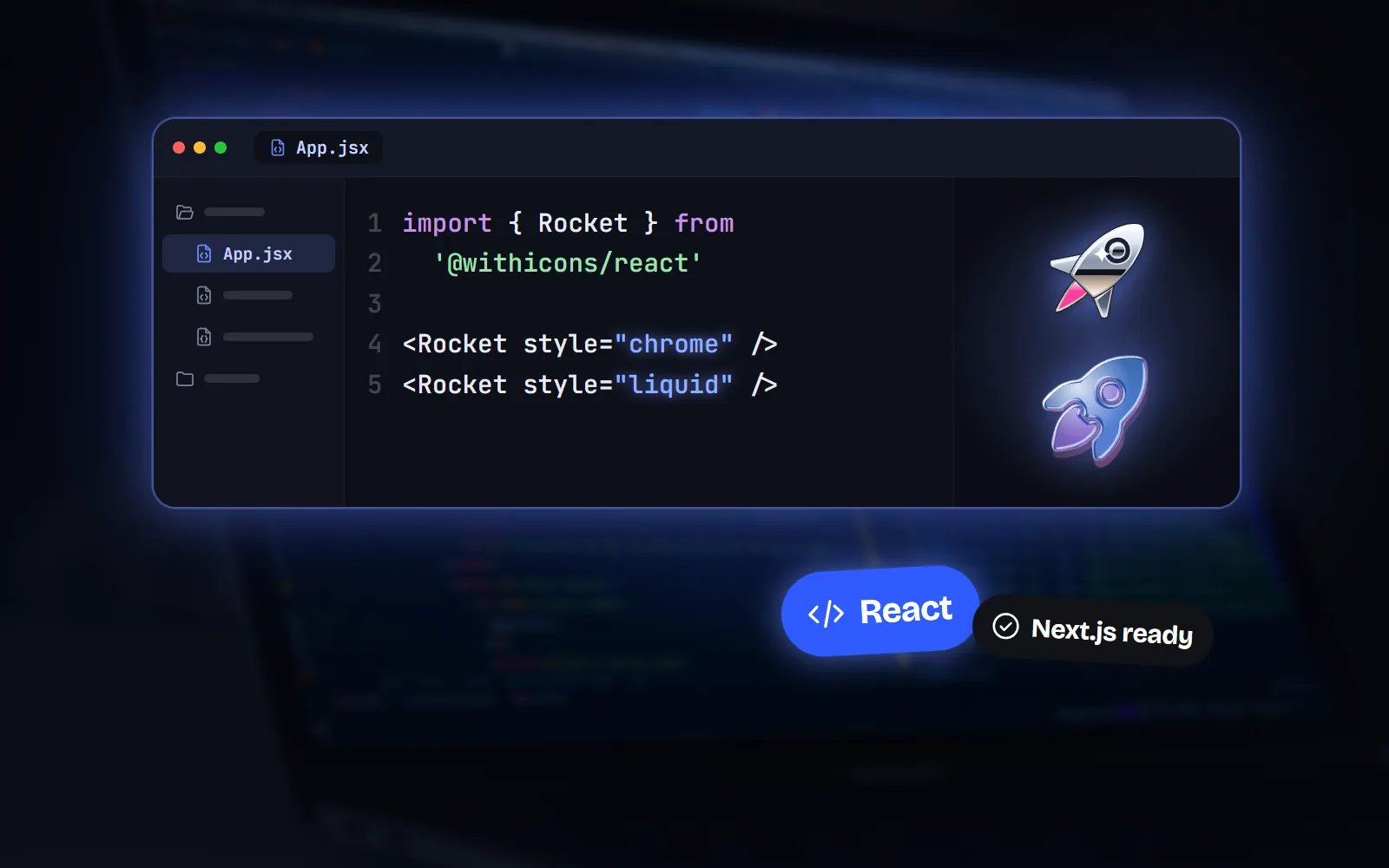
/ssrentry, lucide-react 1.x and MUI icons are client components, and Iconify draws in the browser only. - One family in many looks: with icons (our set) has 1000 icons in 34 styles, 34,000 SVGs, MIT. Fewer icons than Tabler, Phosphor or Lucide.
On this page 9 sections
The best React icon library for most apps is lucide-react: over 2,000 consistent outline icons, typed, tree-shakable and the default in shadcn/ui. Pick Tabler if you need the most free MIT icons, Phosphor for six weights of every icon, Heroicons for a small polished Tailwind set, MUI icons if you already use Material UI, and Font Awesome when you need brand logos. Pick with icons when you want one family of icons in many looks.
A React icon library turns each icon into a component, so you write <Bell /> instead of pasting SVG code. The differences show up in four places: how many icons you get, how many looks, how you import them, and how they behave in the Next.js App Router.
How do the 10 most popular React icon libraries compare?
| Library | npm package | Icons | Styles | Licence |
|---|---|---|---|---|
| lucide-react | lucide-react | Over 2,000 | 1 outline (stroke adjustable) | ISC |
| react-icons | react-icons | 31 bundled sets | Whatever each set has | MIT package; each set keeps its own |
| Heroicons | @heroicons/react | 316 | 4 (outline, solid, mini, micro) | MIT |
| Phosphor | @phosphor-icons/react | About 1,500 | 6 weights | MIT |
| Tabler Icons | @tabler/icons-react | Over 6,200 | 2 (outline, filled for over 1,000) | MIT |
| MUI icons | @mui/icons-material | Over 2,000 | 5 themes | MIT |
| Font Awesome | @fortawesome/react-fontawesome | Over 2,000 free | 3 free (solid, regular, brands) | Icons CC BY 4.0, credit in the files |
| Hugeicons | @hugeicons/react | 6,000+ free | 1 free (10 in Pro) | MIT (free set) |
| Iconify | @iconify/react | Over 300,000 from 200+ sets | Whatever each set has | MIT component; each set keeps its own |
| with icons | @withicons/react | 1000 | 34 (3 interface + 31 creative) | MIT |
If you want the same comparison without the React angle, our guide to the best free icon libraries covers slides, docs and design tools too.
How do you import icons in each React library?
Every library here lets you import one icon at a time, and modern bundlers (Vite, webpack in Next.js, Rollup, esbuild) then drop the icons you never use. That is called tree-shaking. The import style is what you will type every day, so it is worth a look.
| Library | How you import | Next.js App Router |
|---|---|---|
| lucide-react | import { House } from 'lucide-react' | Works; 1.x icons are client components |
| react-icons | import { LuHouse } from 'react-icons/lu' | Works; IconContext needs a client component |
| Heroicons | import { HomeIcon } from '@heroicons/react/24/outline' | Plain server-friendly components |
| Phosphor | import { HouseIcon } from '@phosphor-icons/react' | Use @phosphor-icons/react/ssr on the server |
| Tabler Icons | import { IconHome } from '@tabler/icons-react' | Plain server-friendly components |
| MUI icons | import HomeIcon from '@mui/icons-material/Home' | Client components; needs @mui/material and Emotion |
| Font Awesome | <FontAwesomeIcon icon={faHouse} /> | Import its CSS and set autoAddCss = false |
| Hugeicons | <HugeiconsIcon icon={Home01Icon} /> | Not documented |
| Iconify | <Icon icon="mdi:home" /> | Renders in the browser only |
| with icons | import { Home } from '@withicons/react' | Plain components, no 'use client' |
Why does the last column matter? In the Next.js App Router, pages are Server Components by default: they run on the server and send finished HTML. A plain icon component simply becomes an <svg> in that HTML. A component marked 'use client' still works, but its code also travels to the browser. One that fetches icons at runtime, like Iconify’s, shows nothing until the browser has loaded it.
Also worth knowing: Phosphor’s README warns that root imports can make some bundlers process all 9,000+ of its icon modules in development, and suggests Next.js’s optimizePackageImports. with icons ships each style as one module, so it needs no such setting.
lucide-react vs react-icons: which should you use?
This is the question people search most, and the two are different kinds of thing. lucide-react is one icon family. Its team keeps every icon on a 24 × 24 grid with 2px strokes, so they all match, and new icons arrive often. react-icons is a wrapper. It packs 31 existing sets (Font Awesome, Material Design, Bootstrap, Tabler, Phosphor, Lucide and many more) into one install, each in its own folder.
react-icons is great for prototypes: you can try many sets without installing anything new. For a finished product, three things push most teams towards a single set:
- Licences differ per set. Most are MIT or Apache, but Font Awesome and Game Icons are CC BY and Typicons is CC BY-SA, which ask for a credit.
- Copies can lag behind. Its README lists 1,215 Lucide icons and 5,237 Tabler icons, while Lucide itself now has over 2,000 and Tabler over 6,200.
- Mixing sets shows. Icons from different families have different line weights and corners, so a toolbar built from three sets looks slightly off.
So: lucide-react for a consistent product UI, react-icons for quick experiments. If you like Lucide but want more than outlines, our with icons vs Lucide comparison goes deeper.
Which React icon library has the most icons and styles?
If you keep needing rare icons, size matters. Tabler is the biggest single free MIT set here, with over 6,200 outline icons and filled versions of over 1,000. Hugeicons gives 6,000+ free icons in one rounded style, and its paid Pro plan adds 60,000+ icons in 10 styles. Iconify goes further: one component that loads any of over 300,000 icons from more than 200 sets, fetched from its API as you use them.
For several looks of the same icon, Phosphor is the classic answer: six weights, picked with a weight prop.
with icons takes the idea further in a different direction. Each icon is drawn once and rendered into 34 styles: line, solid and duo for interfaces, plus creative styles for heroes, empty states and marketing pages. In React, every style is its own import path, such as @withicons/react/solid.
Want the numbers in detail? See with icons vs Tabler Icons and with icons vs Phosphor.
What about Heroicons, MUI icons, Font Awesome and Iconify?
Heroicons: best for Tailwind CSS projects
Made by the Tailwind CSS team: 316 icons, each drawn four times (24px outline and solid, 20px mini, 16px micro), so small sizes stay crisp. You size them with classes like size-6 rather than a prop. MIT licence. More in with icons vs Heroicons.
MUI icons: best if you already use Material UI
Over 2,000 official Material Icons in five themes (Filled, Outlined, Rounded, Two tone and Sharp), as MUI SvgIcon components. They depend on @mui/material, which needs Emotion, so they make the most sense in an app that already uses Material UI.
Font Awesome: best when you need brand logos
The free set has over 2,000 icons, including a Brands style with logos most open sets skip (Lucide removed its brand icons in version 1). In React you install a component package, a core package and one package per style. In Next.js, its docs ask you to import its stylesheet in the root layout and set config.autoAddCss = false, or icons render huge. See with icons vs Font Awesome.
Iconify: best for reaching any icon set
One <Icon icon="set:name" /> component reaches the whole Iconify catalogue. The catch: icons are fetched from the Iconify API after the page loads, and its docs say the SVG is not rendered on the server. For Next.js they suggest its web component or build-time tools instead. Each set keeps its own licence. Our Iconify alternative page compares it in more detail.

Where is with icons stronger, and where is it weaker?
Since we make it, here is the honest version.
What’s great
34 styles of every icon. Line, solid and duo for the interface, plus 31 creative styles, all from the same drawings, so a solid active tab or a glossy hero icon always matches the rest.
Server Components with no setup. Components are plain forwardRef components with no hooks or context, so they render in the App Router without 'use client' and need no optimizePackageImports.
Familiar props. size, color, strokeWidth, title and className, close to Lucide’s, and every icon is exported as both Home and HomeIcon.
Outside code too. The same icons are on every icon page as PNG and SVG downloads, for slides, docs and Figma. See the home icon page for an example.
What to keep in mind
Fewer icons. 1000 icons is far fewer than Tabler (over 6,200), Lucide (over 2,000) or Phosphor (about 1,500). If you need rare icons, those sets are more likely to have them.
No brand logos. There are no company logos at all. Use Font Awesome Brands or Simple Icons for those.
Not an iconLibrary option in shadcn/ui. The shadcn CLI cannot install it for you, so you swap icons by hand. Our shadcn/ui icons guide shows how.
Creative styles need room. Styles like gloss, glass or pixel are made for 32px and up. For small interface icons, stick to line, solid or duo.
Which React icon library should you pick?
- Pick lucide-react if you want the safe default: one clean outline style, over 2,000 icons, and you use shadcn/ui.
- Pick Tabler Icons if you need the most free MIT icons, with filled versions for many of them.
- Pick Phosphor if you want six weights of every icon and a duotone look.
- Pick Heroicons if you build with Tailwind and a small, polished set covers you.
- Pick MUI icons if your app already uses Material UI.
- Pick Font Awesome if you need brand logos or already know its classes.
- Pick Hugeicons if you like soft rounded lines and may want paid styles later.
- Pick react-icons or Iconify if you are prototyping across many sets (check each licence).
- Pick with icons if you want one family in 34 matching styles that renders on the server and also works in your slides.
How do you get started with with icons in React?
Install the package and import icons by name. The root is the line style; other styles have their own paths. Icons inherit the text colour, so Tailwind colour classes just work.
npm i @withicons/react

import { Home, Search } from '@withicons/react'
import { Home as HomeSolid } from '@withicons/react/solid'

<Search size={20} className="text-slate-500" />
<HomeSolid title="Home" />
The free React icons page has every icon ready to copy, and the developer docs cover Vue, Svelte, Angular, Solid, the web component and CSS classes. Coming from another library? The Lucide and Tabler alternative pages map the icon names for you.
Frequently asked questions
What is the best icon library for React?
For most apps, lucide-react: over 2,000 consistent outline icons, typed and tree-shakable, ISC licensed, and the default in shadcn/ui. Pick Tabler if you need the most free MIT icons, Phosphor for six weights, Heroicons for Tailwind projects, MUI icons for Material UI apps and Font Awesome for brand logos.
lucide-react vs react-icons: which is better?
lucide-react is one consistent set, maintained by its own team and always current. react-icons wraps 31 different sets (including an older copy of Lucide) behind one install. Use lucide-react for a product UI that should look consistent, and react-icons when you want to borrow icons from many sets during a prototype. Check each set’s licence in react-icons, because some, like Font Awesome and Game Icons, are CC BY.
Which React icon library works best with the Next.js App Router?
Libraries made of plain components with no React context render in Server Components with no setup: Heroicons, Tabler and with icons. Phosphor works when you import from @phosphor-icons/react/ssr. lucide-react 1.x and MUI icons are marked as client components, which works but sends their code to the browser. Font Awesome needs a small CSS setup in your root layout, and Iconify renders only in the browser.
Which React icon library has the most icons?
Iconify gives access to over 300,000 icons from more than 200 sets, loaded from its API. Among single sets, Tabler (over 6,200, MIT) and Hugeicons Free (6,000+, MIT) are the largest. react-icons bundles 31 sets in one package.
Are React icon libraries free for commercial use?
All ten in this guide allow commercial use. lucide-react is ISC; Heroicons, Phosphor, Tabler, MUI icons, Hugeicons Free and with icons are MIT. Font Awesome Free icons are CC BY 4.0, with the credit already in the files. In react-icons and Iconify, every icon set keeps its own licence.
Do React icon libraries make my bundle bigger?
Only by the icons you use, if you import them by name. lucide-react, react-icons, Phosphor, Tabler, Hugeicons and with icons all document tree-shaking. Avoid importing a whole set as an object or loading every icon for dynamic names unless you really need it.
Sources and notes
- Lucide README (ISC licence)
- lucide.dev (icon count shown on the site)
- Lucide icon design specification (24 × 24 grid, 2px stroke)
- Lucide React: getting started (imports, props, tree-shaking)
- Lucide React: migration from v0 (brand icons removed)
- lucide-react 1.70.0 Icon component source ("use client")
- react-icons README (31 icon sets, licences, versions)
- Heroicons README (React imports)
- Heroicons website (316 icons)
- @phosphor-icons/react README (tree-shaking, Next.js, /ssr imports)
- @phosphor-icons/core 2.1.1 (icon counts)
- Tabler Icons README (icon counts, MIT)
- @tabler/icons-react README (props, TypeScript)
- MUI: Material Icons (count, themes, imports, peer dependencies)
- @mui/icons-material 9.5.0 Home icon source ("use client")
- Font Awesome docs: set up with React
- Font Awesome docs: use React with Next.js
- Font Awesome Free licence (GitHub)
- npm: @hugeicons/react (6,000+ free icons, Pro styles)
- Iconify for React (API loading, client-side rendering, icon count)
- npm: @withicons/react 0.6.0 README
- with icons license (MIT)
Facts about other icon sets were checked against their official sites in November 2026. Libraries change, so check the links above for the latest numbers.