a plain-English guide
shadcn icons: how to change the icon library in shadcn/ui
shadcn/ui comes with Lucide, and that is a fine default. Here is what the iconLibrary setting really does, how to swap icons in components you already copied, and how to keep sizes and line weights tidy when you do.
- shadcn/ui uses Lucide (
lucide-react) by default. The default preset sets"iconLibrary": "lucide"in yourcomponents.json. iconLibrarytells the shadcn CLI which icons to write into components when you runadd. It supportslucide,tabler,hugeicons,phosphorandremixicon.- To switch components you already copied, run
npx shadcn@latest migrate icons. It rewrites the imports in youruifolder, installs the new library and updatescomponents.json. - shadcn sizes icons with CSS (usually
size-4, 16px) and Lucide draws a 2px stroke. Keep both in mind when you switch, or your icons will look slightly off. - Other libraries, including with icons (1000 icons in 34 styles), are not on the iconLibrary list, so you swap them by hand. For many apps, keeping Lucide is the right call.
On this page 8 sections
shadcn/ui uses Lucide icons by default. The iconLibrary field in components.json tells the shadcn CLI which icon set to write into components when you add them, and today it supports Lucide, Tabler, Hugeicons, Phosphor and Remix Icon. To change components you already have, run npx shadcn@latest migrate icons, or swap the imports by hand for any other library, with icons included.
shadcn/ui is a popular way to build React interfaces. Instead of installing a component package, you copy each component’s code into your own project and change it as you like. That matters for icons: because the code is yours, you can swap every icon. You just need to know where they come from.
Why does shadcn/ui use Lucide icons?
When you start a project with npx shadcn@latest init and the defaults, the CLI uses its Nova preset, which pairs Lucide with the Geist font. It writes "iconLibrary": "lucide" into components.json and installs lucide-react. Some newer presets choose differently: Maia and Mira use Hugeicons, Lyra uses Phosphor.
The shadcn docs do not explain the choice, but Lucide is an easy fit: over 2,000 clean outline icons on a 24 × 24 grid with 2px strokes, an ISC licence, typed React components, and names that read well in code (CheckIcon, ChevronDownIcon, XIcon). Our with icons vs Lucide post looks at it in detail.
What does iconLibrary in components.json do?
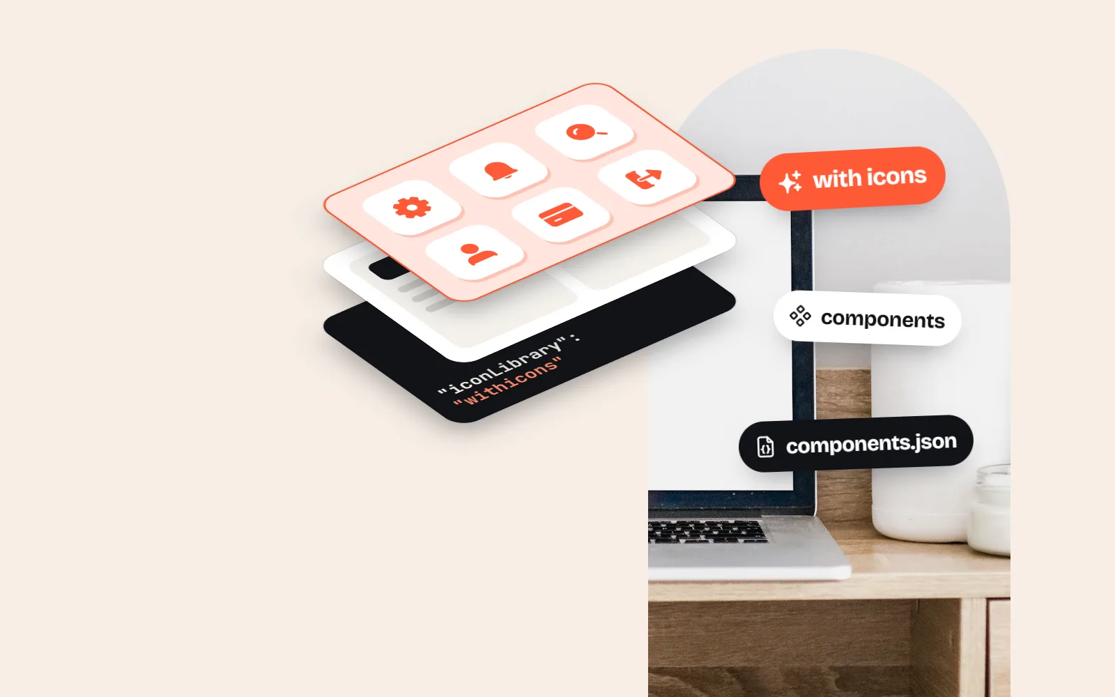
components.json is the small settings file the shadcn CLI reads in your project. The iconLibrary line in it looks like this:
{
  "style": "new-york",
  "rsc": true,
  "iconLibrary": "lucide"
}
It does one job. In the current shadcn styles, each component names its icons once per supported library: the Dialog’s close button lists XIcon for Lucide, IconX for Tabler, Cancel01Icon for Hugeicons and RiCloseLine for Remix Icon. When you run npx shadcn@latest add dialog, the CLI reads iconLibrary, keeps the matching name, writes the import and installs the package. (Older styles such as new-york import lucide-react directly.) It does not touch files you already have, and your app never reads components.json at runtime.
| Value | Package it installs | Free icons | Licence |
|---|---|---|---|
lucide (default) | lucide-react | Over 2,000, one outline style | ISC |
tabler | @tabler/icons-react | Over 6,200, outline + filled | MIT |
hugeicons | @hugeicons/react + @hugeicons/core-free-icons | 6,000+, one rounded style | MIT (free set) |
phosphor | @phosphor-icons/react | About 1,500, in 6 weights | MIT |
remixicon | @remixicon/react | 3,200+, outline + filled | Remix Icon License: no credit needed, but no reselling icons or using them as logos |
The JSON schema accepts any text, but the CLI only knows these five. Writing "withicons" or "heroicons" there will not make add install those icons. For a wider look at the options, see our guide to the best React icon libraries.
How do you change the icon library in shadcn/ui?
If your new library is one of the five, the CLI does almost all of the work. Commit your code first, so you can see exactly what changed.
- 1Commit or stash your changes
The migration edits files in place. A clean git state lets you review the diff and undo it in one step.
- 2Run the migration
Run
npx shadcn@latest migrate iconsand choose the source and target libraries, or skip the questions with--from lucide --to tabler --yes. - 3Let it rewrite your ui folder
It changes icon imports and JSX in your
uidirectory, installs the target package and setsiconLibrary, so laternpx shadcn addcommands use the new library too. - 4Read the leftovers list
Icons with no match in the new library are left untouched and listed at the end. Replace those by hand with the nearest icon.
- 5Fix your own files
The migration covers your
uifolder. Icons in your own pages and features need the same swap, or you can pass a path or glob, like"src/components/**". Scoped runs do not updatecomponents.json.
How do you swap icons in components you already copied?
For any library outside the five, you swap by hand. It is less work than it sounds, because the built-in components only use a handful of icons: checks, chevrons, a circle, a close button, a spinner and a sidebar toggle.
The neatest way is one small file that re-exports the icons you use, under the names your components expect. Then every component imports from that file, and changing library later means editing just one file. Here is what that looks like with with icons:
// components/icons.ts
export { CheckIcon, ChevronDownIcon, ChevronRightIcon, CircleIcon } from '@withicons/react'
export { CloseIcon as XIcon } from '@withicons/react'
export { LoaderCircleIcon as Loader2Icon } from '@withicons/react'
export { SidebarIcon as PanelLeftIcon } from '@withicons/react'
Then, in each component, change from "lucide-react" to from "@/components/icons". Most names match already, because with icons exports every icon as both Check and CheckIcon. Only a few names differ, like Lucide’s XIcon, which is our CloseIcon.
How do you keep icon size and stroke width consistent with shadcn?
Size: let shadcn’s CSS do it
shadcn components size icons with CSS rather than props. The Button, for example, gives any SVG inside it size-4 (16px) unless the icon already has a size- class, and smaller buttons use size-3. CSS beats the width and height an icon component sets, so any SVG icon library follows these rules automatically. To make one icon bigger, add a class like size-5, just as you would with Lucide.
Stroke: pick one weight
This is where switching shows. shadcn never sets a stroke width, so with Lucide you get its default 2px line. Tabler also defaults to 2 (through a stroke prop), Phosphor uses named weights instead, and our line style uses 1.75. At 16px, a 2px line on a 24px grid draws about 1.3 pixels; 1.75 draws about 1.2. You will not notice that alone, but you will next to a different set.
Choose one stroke width for the whole app. If you replace every icon, keep the new library’s default. If some Lucide icons stay, set strokeWidth={2} on the new ones so they match.
Leave a 2px Lucide chevron next to a lighter icon from another set in the same toolbar. The difference is small, but it makes the toolbar look unfinished.
Can you use with icons in shadcn/ui?
Yes. @withicons/react works the way shadcn expects. Icons use currentColor, so classes like text-muted-foreground colour them. They take className, size, color and strokeWidth, like Lucide. And they are plain components with no hooks or context, so they render in Server Components without 'use client'.
npm i @withicons/react

import { CheckIcon } from '@withicons/react'
import { HomeIcon } from '@withicons/react/solid'

<CheckIcon className="size-4" strokeWidth={2} />
<HomeIcon className="size-4" />
What you gain is the other styles. The same icons come in 34 styles, so a sidebar can show the active page in solid and the rest in line, or a dashboard card can use the soft Duo style. Every style is its own import path, such as @withicons/react/solid.
The free React icons page and the developer docs cover setup, and every icon page, like the check icon, has the SVG code to copy if you prefer that.
Should you switch from Lucide at all?
Honestly, most projects should not. Lucide is well drawn, the CLI fully supports it and every shadcn example uses it. A switch costs time, a review of every screen and a few small visual bugs. Do it only for a reason you can name.
Keep Lucide, or switch?
- You keep needing icons Lucide does not have (Tabler has over 6,200).
- You want weights or a duotone look (Phosphor) or a softer, rounded line (Hugeicons).
- You want solid, tinted and illustrated versions of the same icons (with icons, 34 styles).
- You are early in the project, with few screens to check.
- You like the look and Lucide has the icons you need.
- You want every shadcn add to just work, with no extra steps.
- Your app is mostly forms, tables and settings screens.
- The project is large and a switch would mean weeks of review.
A middle path also works: keep Lucide in the built-in components, and use another set only where it adds something, such as feature sections, empty states or the marketing site. Keep each set to its own area, and set the stroke width to match where they meet. Our guide to keeping icons consistent has more tips.
Frequently asked questions
What icons does shadcn/ui use?
Lucide, through the lucide-react package. The shadcn CLI’s default preset sets "iconLibrary": "lucide" in components.json, and the components import icons such as CheckIcon, ChevronDownIcon and XIcon from lucide-react. Some newer presets pick Hugeicons or Phosphor instead.
What values does iconLibrary support in components.json?
The shadcn CLI docs list lucide, tabler, hugeicons, phosphor and remixicon, plus radix as a legacy option for the migrate command. The schema accepts any string, but the CLI only knows how to write icons for those libraries.
How do I change the icons in shadcn/ui?
Run npx shadcn@latest migrate icons and pick the source and target libraries, or pass --from lucide --to tabler. It rewrites icon imports and JSX in your ui folder, installs the new package and updates iconLibrary, so later npx shadcn add commands use the new library. Icons with no match are left alone and listed at the end.
Can I use an icon library that is not on the iconLibrary list?
Yes, by hand. shadcn/ui copies component code into your project, so you can change any import yourself. Replace the lucide-react import in each component with your library and check the icon names. A small icons file that re-exports your icons makes later changes a one-file job.
Why do my icons look thinner or thicker after switching?
Different sets use different stroke widths. Lucide draws 2px lines, Tabler uses a stroke prop that defaults to 2, Phosphor uses weights, and the with icons line style uses 1.75px. At shadcn’s usual 16px size the difference is small but visible next to other icons, so pick one weight and use it everywhere.
Should I switch away from Lucide in shadcn/ui?
Only if you have a reason: you need icons Lucide lacks, you want filled or multi-weight versions, or you want a different look. Otherwise Lucide is well made, fully supported by the CLI and needs no work.
Sources and notes
- shadcn/ui CLI docs (init defaults, migrate icons, supported libraries)
- shadcn/ui manual installation (components.json with iconLibrary)
- shadcn/ui components.json docs
- shadcn/ui components.json schema (iconLibrary)
- shadcn CLI 4.23.0 source (presets and their icon libraries)
- @shadcn/registry 0.2.1 icon library map (packages per iconLibrary value)
- shadcn/ui Button source (icon sizing with size-4)
- shadcn/ui Dropdown Menu registry item (lucide-react icons)
- Lucide React: getting started (size 24, strokeWidth 2)
- Lucide README (ISC)
- lucide.dev (icon count shown on the site)
- Tabler Icons README (icon count, MIT)
- @tabler/icons-react README (stroke prop)
- npm: @hugeicons/react (6,000+ free icons)
- @phosphor-icons/react README (weights)
- Remix Icon README (3200+ icons)
- Remix Icon License v1.0
- npm: @withicons/react 0.6.0 README
- with icons license (MIT)
Facts about other icon sets were checked against their official sites in November 2026. Libraries change, so check the links above for the latest numbers.