icons in code, the 2026 answer
How big should an icon button be, and how do I label it?
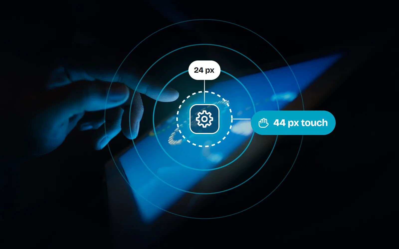
“44 px is the WCAG rule” is the answer you will see most, and it is not quite right. Here are the real numbers from WCAG 2.2, Apple and Android, plus the markup that gives an icon-only button a name and keeps clicks on the button.
- Keep the icon small (16 to 24 px) and make the button bigger with padding. The hit area is what counts, not the drawing.
- WCAG 2.2 level AA (criterion 2.5.8) asks for 24 by 24 CSS pixels, or enough space around a smaller target. 44 by 44 is the stricter AAA goal (2.5.5), not the everyday rule.
- Platforms ask for more on touch: Apple’s default control size is 44 by 44 points on iPhone and iPad, and Android recommends at least 48 by 48 dp. Use 44 px or more for touch on the web.
- Name the button, hide the icon. Put
aria-label="Close"(or visually hidden text) on the<button>andaria-hidden="true"on the SVG. Atitletooltip is not a label. - If
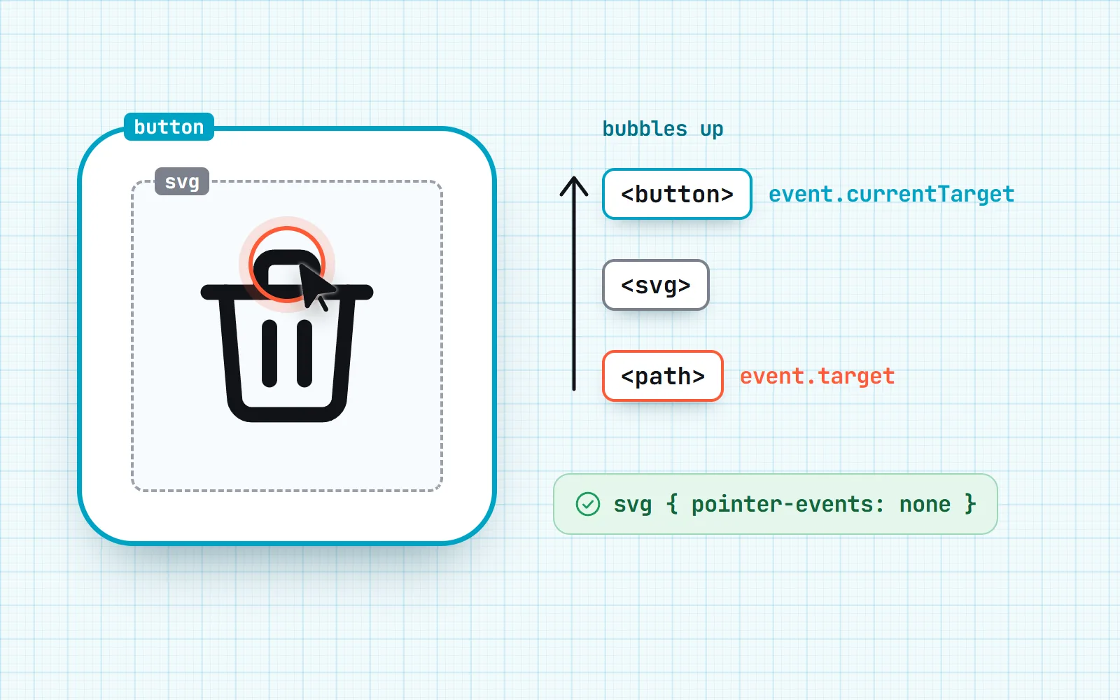
event.targetis the SVG instead of your button, readevent.currentTarget, or addsvg { pointer-events: none }inside buttons.
On this page 8 sections
An icon button should be at least 24 by 24 CSS pixels to meet WCAG 2.2 level AA, and 44 by 44 or more on touch screens, which matches Apple’s default control size (44 points) and sits close to Android’s 48 dp. The icon inside can stay 16 to 24 px: padding makes the button bigger, not the drawing. Then give the button a name with aria-label or visually hidden text, and hide the SVG from screen readers with aria-hidden="true".
Many older answers say “44 px is the WCAG rule”. That number is real, but it is the strictest tier (AAA). In October 2023, WCAG 2.2 added a new level AA rule at 24 px with a spacing exception, and AA is the level most accessibility policies and audits aim for. Below are the real numbers, checked on the W3C, Apple and Android sites in November 2026, then the labelling markup and the event.target bug that trips up almost everyone who puts an SVG inside a button. For the gentler, non-code version, read our guide to accessible icons.
How big should an icon button be?
| Guideline | Size | Where it applies | What kind of rule |
|---|---|---|---|
| WCAG 2.2, 2.5.8 Target Size (Minimum) | 24 x 24 CSS px (or spaced out) | Websites and web apps | Level AA: the level most teams aim for |
| WCAG 2.2, 2.5.5 Target Size (Enhanced) | 44 x 44 CSS px | Websites and web apps | Level AAA: the stricter goal |
| Apple HIG, iOS and iPadOS | 44 x 44 pt default, 28 x 28 pt minimum | iPhone and iPad apps | Design guidance |
| Apple HIG, macOS | 28 x 28 pt default, 20 x 20 pt minimum | Mac apps (mouse and trackpad) | Design guidance |
| Android and Material | 48 x 48 dp or larger (about 9 mm) | Android apps | Design guidance |
Points (pt) on Apple devices and density-independent pixels (dp) on Android are both “virtual” units that stay about the same physical size on any screen, much like CSS pixels on the web. So 44 CSS px, 44 pt and 48 dp are all roughly a fingertip.
Our rule of thumb for the web: 44 px for anything people tap on a phone, never below 24 px anywhere, and if a dense desktop toolbar needs small buttons, space them out (see the exception below). Apple also gives a hint about spacing: about 12 points of padding around controls with a visible shape, and about 24 points around ones without.
What does WCAG 2.2 actually require for target size?
Criterion 2.5.8 says the target for a pointer (a mouse, finger or stylus) must be at least 24 by 24 CSS pixels, except in five cases:
- Spacing: a smaller target is fine if you can draw a 24 px circle centred on it and that circle does not touch another target or another small target’s circle.
- Equivalent: the same action is available from another control on the page that is big enough.
- Inline: the target is a link in a sentence, sized by the text around it.
- User agent control: the browser draws it and you have not restyled it (a default checkbox, for example).
- Essential: the exact size is essential or legally required, like pins on a map.
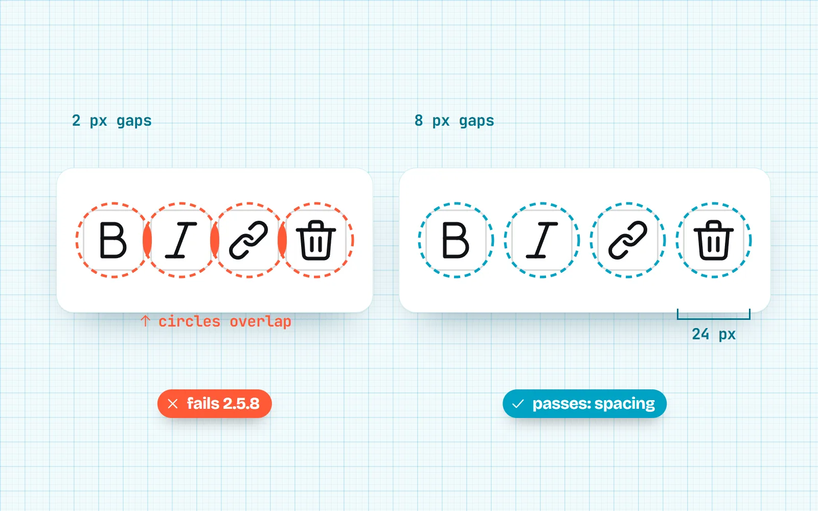
The “target” is the area that responds to the click, not the visible drawing. A 20 px icon inside a button with 12 px of padding has a 44 px target, and that is what 2.5.8 measures. The stricter 2.5.5 (AAA) asks for 44 by 44 and drops the spacing exception.
How do I make the button bigger without making the icon bigger?
Size the button, not the icon. Every with icons drawing is made on a 24 x 24 grid and stays crisp at 16, 20 or 24 px, so the icon can stay neat while padding gives fingers room.
.icon-btn {
  display: inline-grid;
  place-items: center;
  min-width: 44px;
  min-height: 44px;     /* the target */
  padding: 0;
  border: 0;
  border-radius: 10px;
  background: transparent;
  color: inherit;
}
.icon-btn svg { width: 20px; height: 20px; }   /* the drawing */
.icon-btn:focus-visible { outline: 2px solid currentColor; outline-offset: 2px; }
Need a compact look? You can keep a 32 px visual button and grow only the clickable area with an invisible pseudo-element (.icon-btn::after { content: ""; position: absolute; inset: -6px; } on a position: relative button). Just make sure neighbouring hit areas do not overlap, or a tap may land on the wrong one. For glyph sizes everywhere else, our icon sizes guide has a full chart.
How do I label an icon-only button?
A button with only an icon still needs a name: the word a screen reader says, such as “Close” or “Search”. Name it after what it does, not what it looks like (“Search”, not “magnifying glass”). There are three ways people try, and only two of them work well.
| Method | Screen readers | Translation tools | Visible to sighted people | Verdict |
|---|---|---|---|---|
aria-label="Close" on the button | patchy, test it | Good, short | ||
| Visually hidden text inside the button | real page text | Best for multilingual sites | ||
title="Close" only | inconsistent | mouse hover only | Not a label |
<!-- 1. aria-label -->
<button type="button" class="icon-btn" aria-label="Close">
  <svg aria-hidden="true" viewBox="0 0 24 24">…</svg>
</button>

<!-- 2. visually hidden text -->
<button type="button" class="icon-btn">
  <svg aria-hidden="true" viewBox="0 0 24 24">…</svg>
  <span class="visually-hidden">Close</span>
</button>
.visually-hidden {
position: absolute;
width: 1px; height: 1px;
margin: -1px; padding: 0; border: 0;
overflow: hidden;
clip-path: inset(50%);
white-space: nowrap;
}Why not title? MDN calls the title attribute “highly problematic” for touch, keyboard and screen reader users, because browsers and assistive tools handle it inconsistently. A tooltip can be a nice extra for mouse users, but build it so it also shows on keyboard focus, and keep the real name in aria-label or hidden text.
One more rule if the button does show a word, like a “Show” button next to a password: the hidden name must include that visible word (WCAG 2.5.3, Label in Name). “Show password” is fine; “Reveal secret” is not, because someone using voice control will say “click Show”.
Should the SVG inside the button have aria-hidden?
Yes. Once the button has a name, the icon is decoration. Mark it aria-hidden="true" so a screen reader does not announce an extra “image” or read out a stray title. Two old habits you can drop:
focusable="false"was a fix for Internet Explorer 11 and the old pre-Chromium Edge, which could put inline SVGs in the Tab order. It does no harm, but modern browsers do not need it.role="img"with<title>inside a button names the picture, not the button, and may make a screen reader say both. Keeprole="img"+ a label for icons that stand alone and carry meaning, like a status icon in a table.
Our packages do this for you: React, Vue, Svelte, Angular and Solid components and the <with-icon> element render aria-hidden="true" unless you pass a title or label, and CSS-class icons are empty tags with nothing to read. Inside a labelled button, leave them decorative.
Why is event.target the SVG instead of my button?
This one confuses everyone once. You attach a click listener to a button, click it, and event.target is a <path> or <svg>. Your event.target.dataset.id is suddenly undefined.
Nothing is broken. A click happens on the deepest element under the pointer, which is the icon’s shape, and then “bubbles” up to the button. target is where the click happened; currentTarget is the element your listener is attached to. Three fixes, from simplest:
// 1. Read the element the listener is on
button.addEventListener('click', (event) => {
  console.log(event.currentTarget.dataset.id)   // always the button
})

// 2. One listener for many buttons (event delegation)
toolbar.addEventListener('click', (event) => {
  const btn = event.target.closest('button')
  if (!btn) return
  console.log(btn.dataset.id)
})
/* 3. Never let the icon be the target */
button svg { pointer-events: none; }In React, write the handler on the button and read event.currentTarget; TypeScript then knows it is an HTMLButtonElement. One gotcha from MDN: currentTarget is only set while the handler runs. Log the event and look at it later, and it shows null.
Use a real <button>, give it a 44 px hit area on touch, name it with aria-label or hidden text, and hide the SVG with aria-hidden="true".
Make a 16 px clickable SVG, rely on title as the only name, or read event.target and hope the click landed on the button.
The bottom line
Small icon, big button, clear name. Use 24 px as the floor, 44 px for touch, the platform’s own numbers in native apps, and a name on every icon-only button. Building a field with an eye or clear button? Our post on icons inside input fields puts these rules to work. Every icon on with icons works this way, from close to menu, in the Line style, Solid style and Duo style styles made for interfaces.
Frequently asked questions
Is 44 px the WCAG minimum for touch targets?
No. 44 by 44 CSS pixels is criterion 2.5.5, which is level AAA, the strictest tier. At level AA, the level most accessibility policies aim for, WCAG 2.2 added 2.5.8: at least 24 by 24 CSS pixels, or small targets spaced so a 24 px circle around each one does not touch another target.
Should I use 44 or 48 for tap targets?
Follow the platform. Apple’s Human Interface Guidelines give 44 by 44 points as the default control size on iPhone and iPad. Android recommends at least 48 by 48 dp. On the web, 44 CSS px is a sound default for touch, and 24 is the AA floor for dense desktop toolbars.
Does the icon have to be 44 px?
No. The icon can stay 20 or 24 px. The button around it is what people tap, so give the button padding or a minimum width and height. Big icons in small spaces look heavy; small icons in comfortable buttons look tidy and are easy to hit.
aria-label or visually hidden text: which is better?
Both give the button a name screen readers read out. Visually hidden text is real page text, so it is picked up by translation tools and shows when CSS fails; aria-label is shorter to write. Browser translation of aria-label is still patchy: in Adrian Roselli’s July 2025 retests, no browser translated an aria-label that changed after the page loaded. On multilingual sites, prefer hidden text.
Do I still need focusable="false" on SVG icons?
Only if you still support Internet Explorer 11 or the old pre-Chromium Edge, which could put inline SVGs in the Tab order. Modern browsers do not. It is harmless, which is why it is still copied into examples, including MDN’s.
Why is event.target my SVG and not the button?
Because the click landed on the icon inside the button, and the event bubbled up to your listener. event.target is where the click happened; event.currentTarget is the element your listener is on. Use currentTarget, or event.target.closest('button') when one listener handles many buttons.
Sources and notes
- W3C: Understanding WCAG 2.2 SC 2.5.8 Target Size (Minimum), Level AA, checked November 2026
- W3C: Understanding WCAG 2.2 SC 2.5.5 Target Size (Enhanced), Level AAA, checked November 2026
- W3C: Web Content Accessibility Guidelines (WCAG) 2.2, Recommendation of October 2023
- Apple Human Interface Guidelines: Accessibility (default and minimum control sizes), checked November 2026
- Android Developers: Make apps more accessible (48dp touch targets), checked November 2026
- Android Accessibility Help: Touch target size (48dp, about 9 mm), checked November 2026
- MDN: aria-label (prefer visible text and aria-labelledby), checked November 2026
- MDN: the title attribute (accessibility concerns), checked November 2026
- W3C: Understanding SC 2.5.3 Label in Name, checked November 2026
- Adrian Roselli: aria-label Does Not Translate (2019, updated 2025)
- MDN: Event.currentTarget, checked November 2026
- Stack Overflow: Click event on button is sending an icon as the target? (question 22962386)
Facts about other icon sets were checked against their official sites in November 2026. Libraries change, so check the links above for the latest numbers.