design basics, explained
Accessible icons: a friendly guide to icons everyone can understand
Icons should help people, not puzzle them. Here are the simple habits that make icons work for everyone, including people who use screen readers, see colours differently or tap with shaky hands.
- Add a text label next to icons whenever you can. Only a few icons, like home, print and search, are understood by almost everyone.
- Icon-only buttons need a name. Screen readers cannot see the picture, so give the button a hidden label such as “Search” (on the web, with
aria-label). - Hide decorative icons from screen readers when the text next to them already says the same thing.
- Contrast and size: meaningful icons need at least 3:1 contrast with their background (WCAG 1.4.11), and tap targets should be at least 24 by 24 px (WCAG 2.5.8), ideally 44 or more.
- Never rely on colour alone. Use different shapes and words, not just red and green.
On this page 11 sections
An accessible icon is one that everybody can understand and use: people who use screen readers, people with low vision, people who see colours differently, and people who tap with a shaky thumb on a bumpy bus. The good news is that it mostly comes down to five friendly habits.
Here they are: put a word next to the icon when you can, give icon-only buttons a name, hide purely decorative icons from screen readers, make icons dark enough to see (at least 3:1 contrast), and make buttons big enough to tap (at least 24 by 24 pixels, ideally 44). This guide explains each one gently, with examples, and almost no code.
- 3:1
- minimum contrast for meaningful icons
- 24 px
- minimum tap target (WCAG 2.2)
- 44 pt
- Apple’s default button size
- 1 in 12
- men have a colour vision deficiency
Who are accessible icons for?
More people than you might think. Accessibility is often pictured as a small group, but icons touch all of these:
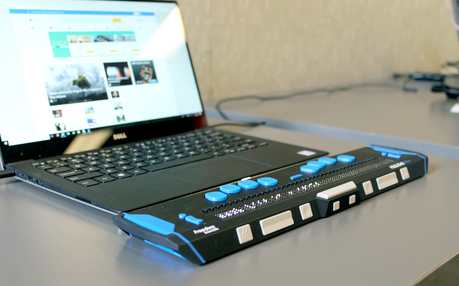
- Screen reader users. A screen reader is software that reads the screen out loud (or on a braille display). It cannot “see” a picture, so it needs words.
- People with low vision. Faint grey icons and tiny buttons are hard to make out.
- People who see colours differently. Colour vision deficiency affects about 1 in 12 men and 1 in 200 women, according to Colour Blind Awareness.
- People with motor difficulties, and anyone using a phone one-handed, in the cold or on the move. Small targets mean wrong taps.
- People new to your product, or reading in a second language, who simply do not know what your icons mean yet.
Should icons have text labels?
Yes, whenever you have room. Researchers at Nielsen Norman Group found that only a handful of icons, such as home, print and the magnifying glass for search, are understood by almost everyone. Their advice is to keep icon labels visible at all times, not hidden behind a hover.
Try it yourself. What does each of these icons do?
A star could mean “favourite”, “rate” or “featured”. A flag could mean “report” or “mark as important”. A label like “Save” turns a puzzle into an instruction. For help picking icons that people read correctly, see how to choose the right icon.
How do you make an icon-only button accessible?
Sometimes there is no room for a word, like the search button in a busy header or the close “X” on a pop-up. That is fine, but the button still needs a name: a short word that a screen reader can say, such as “Search” or “Close”. Without it, a screen reader user may just hear “button” and have to guess.
On a website, the usual way to add a hidden name is aria-label. It is an extra attribute on the button that screen readers read out but sighted visitors do not see. The icon inside is then marked as hidden (aria-hidden="true"), so it is not announced twice. It looks like this:
<button type="button" aria-label="Search">
  <svg aria-hidden="true" focusable="false" width="24" height="24">…</svg>
</button>
A few gentle tips for writing the name:
- Describe what the button does, not what it looks like: “Search”, not “magnifying glass”.
- Keep it short and do not add the word “button”. Screen readers already say that.
- If the button has a tooltip, use the same words, so everyone hears and sees the same thing.
What is the difference between decorative and meaningful icons?
A decorative icon adds looks but no new information, because the text next to it already says the same thing. A meaningful icon carries information that is not written anywhere else. The W3C rules (WCAG 1.1.1) ask for decorative images to be hidden from screen readers and meaningful ones to have a text alternative.
| Example | Type | What to do |
|---|---|---|
| A gear icon next to the word “Settings” | Decorative | Hide it from screen readers. The word does the job. |
| A magnifying glass button with no text | Meaningful | Give the button a name: “Search”. |
| A red warning triangle beside a form field, with no message | Meaningful | Add a text message, like “Email is required”. |
| Feature icons above headings on a slide | Decorative | Mark as decorative (PowerPoint and Word have a checkbox for it). |
| A row of stars showing a 4 out of 5 rating | Meaningful | Add text such as “Rated 4 out of 5”. |
In PowerPoint, Word and Excel, open the Alt Text pane and tick Mark as decorative for icons that only decorate. The with icons code components (on npm as @withicons/react, @withicons/vue and more) hide icons from screen readers by default, and you add a title only when an icon stands alone and carries meaning.
How much contrast do icons need?
Contrast is how much an icon stands out from its background, written as a ratio. 1:1 means no difference at all (white on white). 21:1 is the maximum (black on white). The W3C success criterion 1.4.11 Non-text Contrast (level AA) says that graphics people need to understand, including meaningful icons, should reach at least 3:1 against the colours next to them.
| Grey on white | Contrast ratio | OK for a meaningful icon? |
|---|---|---|
| #767676 (medium grey) | 4.5:1 | Yes |
| #949494 (light-medium grey) | 3.0:1 | Just passes |
| #AAAAAA (light grey) | 2.3:1 | No |
| #CCCCCC (very light grey) | 1.6:1 | No |
Two practical notes. First, disabled buttons and purely decorative icons are not covered by this rule. Second, thin line icons look lighter than their colour suggests, because so little of the icon is actually “ink”. If a line icon looks faint, make it darker or switch to the solid style.
How big should icon buttons be?
Big enough to hit without aiming carefully. Here is what the main guidelines say:
- WCAG 2.2, criterion 2.5.8 (level AA): targets should be at least 24 by 24 CSS pixels, or have enough empty space around them.
- WCAG 2.2, criterion 2.5.5 (level AAA): the stricter goal is 44 by 44 CSS pixels.
- Apple: a default control size of 44 by 44 points on iPhone and iPad.
- Google (Android): touch targets of at least 48 by 48 dp.
The trick is that the icon does not need to grow. A 24 px icon can sit inside a 44 px button, with padding doing the work. That keeps your design neat and your buttons easy to tap. Our icon sizes guide has more on picking sizes.
Why should you never rely on an icon or colour alone?
WCAG criterion 1.4.1 Use of Color (level A) says colour must not be the only way to show information. A green dot for “online” and a red dot for “offline” look identical to many people with colour vision deficiency. The fix is easy: use different shapes and add a word.
The same goes for icons on their own. An icon in a form error is a nice extra, but the message (“Please enter your email”) is what actually helps. Treat icons as a helper for text, not a replacement.
How do screen readers handle icons?
A screen reader goes through the page and reads out text, buttons, links and images. What it says for an icon depends on how the icon was added:
- Hidden icon: skipped completely. Perfect for decorative icons next to text.
- Icon with a name: read out by its name, like “Search, button”. Perfect for icon-only buttons.
- Icon with no name and not hidden: it might be skipped, read as “image” or “graphic”, or read as a file name, depending on the screen reader and browser. This is the case to avoid.
Icon fonts can add one more surprise: since each icon is secretly a text character, some setups read out a strange symbol. SVG icons, like the ones in with icons, avoid this.
A quick accessible icons checklist
- 1Label it
Put a visible word next to the icon wherever there is room.
- 2Name icon-only buttons
Give every icon-only button a short name that says what it does.
- 3Hide the decoration
Mark decorative icons as hidden or decorative so they are not read twice.
- 4Check contrast
Meaningful icons need at least 3:1 against their background. Darken faint greys.
- 5Make targets big
At least 24 by 24 px, ideally 44 px or more on touch screens, with space between.
- 6Do not rely on colour
Use different shapes and words for success, warning and error.
Pair a clear icon with a short word, keep it dark enough to see, and wrap it in a button that is easy to tap.
Use a pale grey, icon-only button with no name, and show errors only by turning something red.
The bottom line
Accessible icons are not harder to make, just more thoughtful. Labels, names, contrast and size help everyone, not only people with disabilities. Pick icons that are clear on their own, then add the words that remove any doubt. Every icon in with icons is a clean SVG, so it is easy to label, hide or recolour for good contrast.
Frequently asked questions
Do icons need alt text?
It depends on the job. If an icon sits next to a word that says the same thing, hide it from screen readers (mark it as decorative). If the icon is the only way to understand something, like an icon-only button or a status icon, it needs a short text name.
What is aria-label?
It is a small piece of HTML that gives an element a name that screen readers read out loud, without showing it on screen. It is most useful for icon-only buttons, for example a magnifying glass button named “Search”. Visible text is still better when you have room for it.
What contrast ratio do icons need?
Under WCAG 2.2 success criterion 1.4.11 (level AA), icons that people need to understand should have a contrast ratio of at least 3:1 against the colours next to them. Purely decorative icons and disabled controls are not covered.
How big should an icon button be?
WCAG 2.2 asks for tap targets of at least 24 by 24 CSS pixels (or enough space around smaller ones). Apple recommends 44 by 44 points on iPhone and Google recommends 48 by 48 dp on Android. The icon itself can stay 24 px; padding makes the button bigger.
Are icons bad for accessibility?
No. Icons help many people, including people who read slowly or speak another language. They only cause problems when they are unlabelled, too faint, too small, or used as the only way to show meaning.
Sources and notes
- W3C: Understanding SC 1.1.1 Non-text Content
- W3C: Understanding SC 1.4.1 Use of Color
- W3C: Understanding SC 1.4.11 Non-text Contrast
- W3C: Understanding SC 2.5.3 Label in Name
- W3C: Understanding SC 2.5.8 Target Size (Minimum)
- W3C: Understanding SC 2.5.5 Target Size (Enhanced)
- MDN: aria-label
- Nielsen Norman Group: Icon Usability
- Apple Human Interface Guidelines: Accessibility
- Android Developers: Make apps more accessible
- Microsoft Support: Add alternative text (Mark as decorative)
- Colour Blind Awareness: Colour blindness
Facts about other icon sets were checked against their official sites in October 2026. Libraries change, so check the links above for the latest numbers.