icons in code, the 2026 answer
How to put an icon inside an input field
The most viewed answer online is from 2009 and uses a background GIF. Here is the version that works today: a small wrapper, an inline SVG you can recolour, and real buttons for icons that do something.
- Wrap the input in a
position: relativebox, place an inline SVG on top withposition: absolute, and add padding to the input so the text never runs under the icon. - Add
pointer-events: noneto a decorative icon so clicks fall through to the field, and hide it from screen readers witharia-hidden="true". - An icon that does something is a real
<button type="button">with a name, like “Show password” or “Clear search”, never a clickable picture. - Use logical properties (
inset-inline-start,padding-inline-start) so the icon moves to the right side in Arabic or Hebrew without extra CSS. - Skip the old
background-imagetrick for icons you want to theme: an image in a background cannot followcurrentColor, so it will not change colour on focus or in dark mode.
On this page 8 sections
To put an icon inside an input field, wrap the input in a box with position: relative, place an inline SVG icon on top of it with position: absolute, and give the input enough padding on that side so the text starts after the icon. Add pointer-events: none so clicks on the icon reach the field. If the icon does something, like showing a password or clearing a search, make it a real button instead.
The answer most people find first, a Stack Overflow thread with over a million views, was written in 2009: a GIF as a background image, plus notes on Internet Explorer 6. It skips what matters now: recolouring, focus states, right-to-left languages and buttons screen readers can use. Below is the version we would ship today, checked against MDN and the GOV.UK Design System in November 2026.
How do I put an icon inside an input field?
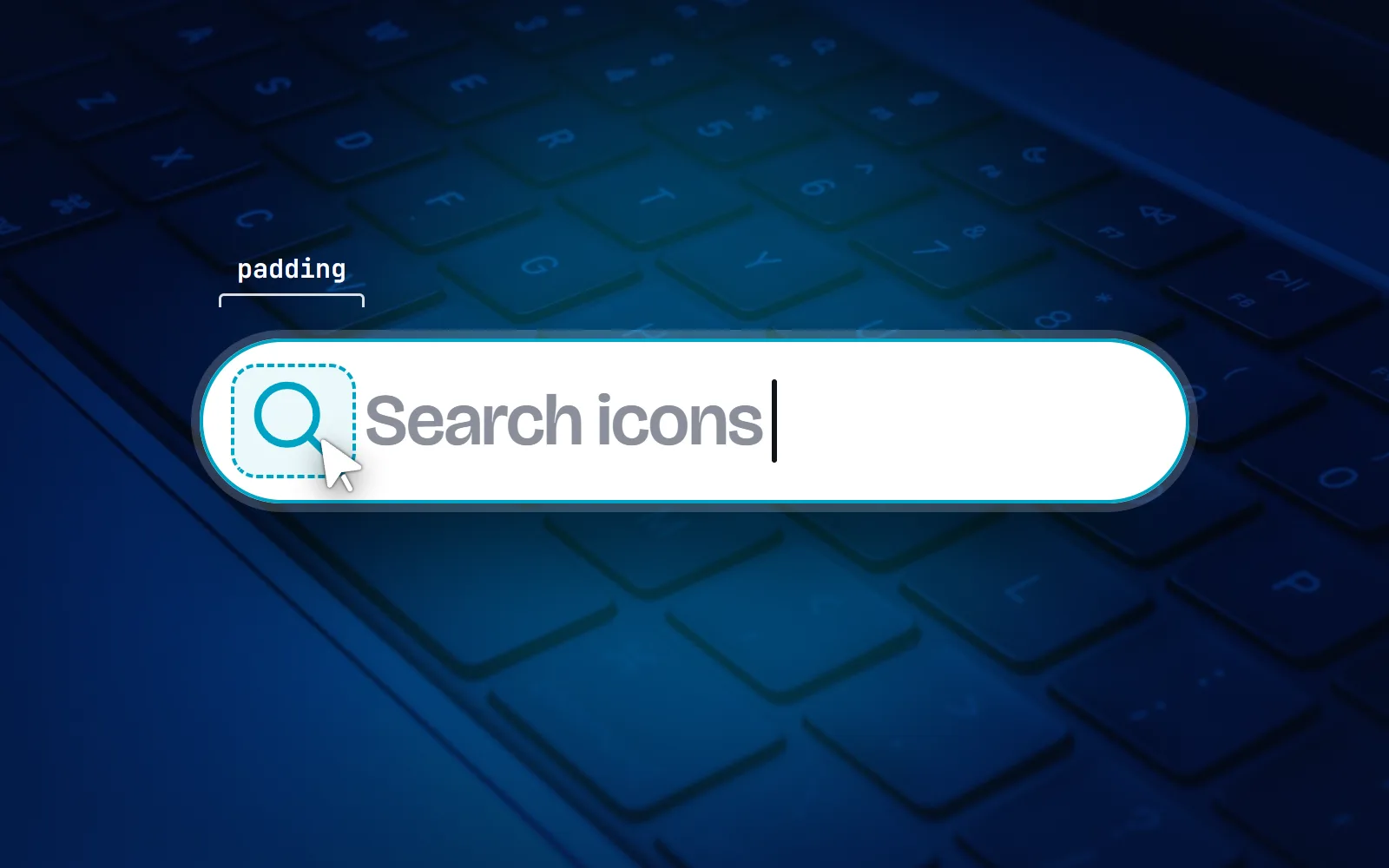
Think of it as two layers. The input is the bottom layer and fills the box. The icon is a small sticker placed on top, near one edge. The padding is a polite “keep out” zone, so typed text does not slide under the sticker.
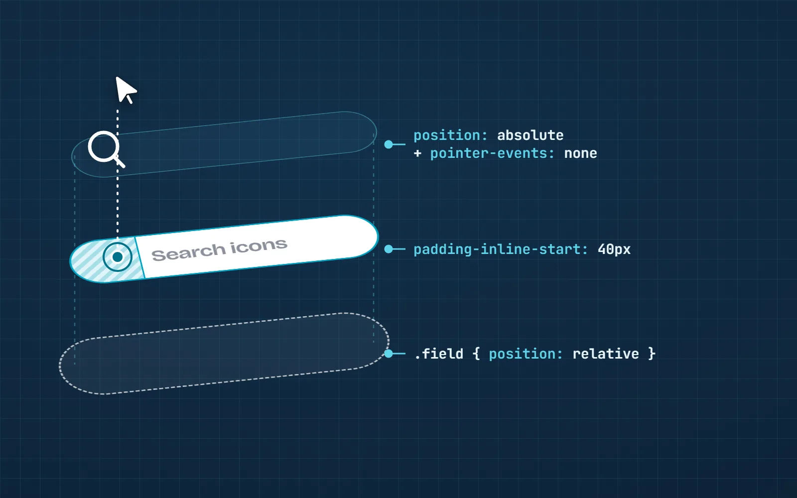
Here is a complete, copy-ready version. The icon is drawn with stroke="currentColor", so it takes its colour from CSS like text does. Any icon from our set works, because every with icons drawing paints its lines with currentColor.
<search>
  <div class="field">
    <svg class="field__icon" aria-hidden="true" width="20" height="20" viewBox="0 0 24 24"
         fill="none" stroke="currentColor" stroke-width="1.75">…search icon…</svg>
    <input type="search" name="q" aria-label="Search icons" placeholder="Search icons">
  </div>
</search>
.field { position: relative; }
.field__icon {
position: absolute;
inset-inline-start: 12px; /* left in English, right in Arabic */
top: 50%;
transform: translateY(-50%);
pointer-events: none; /* clicks go to the input */
color: #6b7280;
}
.field input {
width: 100%;
padding-block: 10px;
padding-inline: 40px 12px; /* room for the icon at the start */
}
.field:focus-within .field__icon { color: #2f5bff; }Four small details do the heavy lifting:
aria-hidden="true"on the SVG. The magnifying glass is decoration: the field already has a name (“Search icons”), so a screen reader should not also announce a picture.pointer-events: none. Without it, a click right on the icon hits the picture, not the field, and nothing happens. With it, the click falls through and the cursor appears.- The padding matches the icon. 12 px gap + 20 px icon + 8 px breathing room = 40 px. Change one, change the other.
:focus-withinon the wrapper recolours the icon while the field is selected. It has worked in every major browser since January 2020.
Why not use a background image, like the old answer?
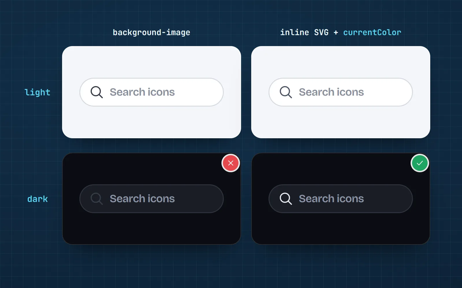
The 2009 answer sets the icon as the input’s background-image and pads the text. It is short, and for a fixed grey icon on a fixed white field it is fine. The catch is colour: an image in a background is a finished picture. Your page’s CSS cannot reach into it, so it cannot follow currentColor. It stays the same grey when the field is focused, when it shows an error, and in dark mode, where a dark icon on a dark field quietly disappears. Our post on how to change an SVG icon’s colour with CSS explains why in more detail.
Another old suggestion was an icon font pseudo-element on the input. That never worked: an <input> is a “void” element, which means it has no inside, so ::before and ::after do not appear on it. If you love the no-extra-markup style, put the pseudo-element on the wrapper and draw it with a CSS mask, which does follow currentColor. We cover that in how to use SVG icons in CSS.
| Approach | Recolours with CSS | Can become a button | No extra markup |
|---|---|---|---|
| Inline SVG on a wrapper | currentColor | wrap it in one | a wrapper + the SVG |
| CSS mask on the wrapper (::before) | via background-color | a wrapper | |
| background-image on the input | colours are fixed | ||
| Icon font ::before on the input | it never shows |
How do I add a search icon inside a search box?
Use the recipe above with three extras that the old answers never mention:
- 1Wrap it in
<search>The
<search>element tells screen readers “this is the search area”. It has been Baseline (working in every major browser) since October 2023. Inside a form,role="search"on the form does the same. - 2Give the field a name
Placeholder text is not a label: it vanishes as soon as someone types. Use a visible
<label>, oraria-labelwhen the design has no room, as MDN suggests for search fields. - 3Decide if the icon is a button
A magnifier at the start is usually decoration. A magnifier at the end that runs the search is a submit button:
<button type="submit" aria-label="Search">with the icon inside.
Prefer a component to pasting SVG code? With our React icons it is <Search size={20} className="field__icon" />. Our components and the <with-icon> web component are hidden from screen readers by default, so you do not need to add aria-hidden yourself. The HTML guide shows the no-build options.
How do I add a show password eye icon?
This is where copied snippets go wrong. People click the eye, so it must be a real <button>. A clickable <span> or SVG cannot be reached with the Tab key and has no name.
<label for="pw">Password</label>
<div class="field">
  <input id="pw" type="password" autocomplete="current-password" spellcheck="false">
  <button type="button" class="field__btn" aria-controls="pw"
          aria-pressed="false" aria-label="Show password">
    <svg aria-hidden="true" width="20" height="20" viewBox="0 0 24 24">…eye icon…</svg>
  </button>
</div>

<script>
  const pw = document.getElementById('pw')
  const btn = pw.nextElementSibling
  btn.addEventListener('click', () => {
    const show = pw.type === 'password'
    pw.type = show ? 'text' : 'password'
    btn.setAttribute('aria-pressed', show)
  })
</script>
.field__btn {
position: absolute;
inset-inline-end: 4px;
top: 50%;
transform: translateY(-50%);
width: 40px; height: 40px; /* a comfortable hit area */
display: grid; place-items: center;
border: 0; border-radius: 8px;
background: none; color: inherit;
}
.field__btn:focus-visible { outline: 2px solid #2f5bff; }
.field:has(.field__btn) input { padding-inline-end: 48px; }The name stays “Show password” and aria-pressed says whether it is on, which is the standard pattern for a toggle button. The GOV.UK Design System also suggests autocomplete="current-password" (or new-password on sign-up) and spellcheck="false", so the browser does not offer to “correct” a password. The button is 40 px square even though the icon is 20 px: how big a hit area should be is its own question, answered in our post on icon button sizes and labels.
To show the state, swap the eye icon for eye-off. With @withicons/motion you do not need any extra script: put both icons in a wm-swap wrapper inside the button, and the second one shows whenever the button has aria-pressed="true". Try the two below.
How do I add a clear (X) button inside an input?
Some browsers, Chrome among them, already add a small clear cross to type="search" fields, and in Chrome the Escape key clears the text too, as MDN notes. If that is enough, you are done. If you want your own (to match your icons, or to show it on other fields), it is the same pattern as the eye:
- A
<button type="button" aria-label="Clear search">at the end of the field, with the close icon inside andaria-hiddenon the SVG. - On click, empty the input and move focus back to it, so the person can type again straight away.
- Hide the button while the field is empty, for example with
.field:has(input:placeholder-shown) .field__btn { display: none; }.
Does an icon inside an input work in right-to-left languages?
It does if you use logical properties. inset-inline-start and padding-inline-start mean “the side where text starts”: the left in English, the right in Arabic, Hebrew or Persian. Old answers use left and padding-left, which leave the icon stuck on the wrong side and the text overlapping it. Both logical properties have been Baseline for years (since January 2020 and April 2021).
Should the icon itself flip? A magnifier, envelope or lock should not; an arrow on a “go” button usually should. Our packages leave icons alone unless you opt in with mirror-rtl on <with-icon> or the with-rtl class.
Use inset-inline-start and padding-inline-start, test the field with dir="rtl" on the page, and mirror only icons that point a direction.
Hard-code left: 12px and padding-left, or mirror every icon in RTL. A backwards magnifying glass looks like a typo.
How do I style the icon for focus, errors and dark mode?
Because the icon paints with currentColor, every state is one line of CSS on the wrapper. Pick colours with enough contrast: a grey icon that hints at the field’s purpose should still be easy to see against the field.
.field:focus-within .field__icon { color: var(--accent); }
.field:has(input[aria-invalid="true"]) .field__icon { color: var(--danger); }
@media (prefers-color-scheme: dark) { .field__icon { color: #9ca3af; } }
For a filled active state, swap the Line style icon for its Solid style twin on focus. Stay with the everyday styles in fields: the creative ones are made for illustrations. Our accessible icons guide covers contrast in plain words.
Need icons for your form? Every icon page on with icons has Copy SVG code, an SVG download and React, Vue, Svelte and HTML snippets, and all the SVG icons are free under MIT with no attribution.
Frequently asked questions
Can I put an icon inside an input with ::before?
No. An <input> is a “void” element: it has no inside, so ::before and ::after do not show on it. Put the pseudo-element (or the SVG) on a wrapper around the input instead.
How do I make the search icon clickable?
Decide what the click should do. If it should only focus the field, keep the icon decorative with pointer-events: none, so the click lands on the input underneath. If it should submit the search, make it a real <button type="submit" aria-label="Search"> with the icon inside.
How do I add a show password eye icon?
Put a <button type="button"> next to the password input, inside the same wrapper. Give it a name such as “Show password”, and on click switch the input between type="password" and type="text" while setting aria-pressed to true or false. Swap the eye for an eye-off icon to show the state.
How do I put an icon on the right side of an input?
Use inset-inline-end on the icon and padding-inline-end on the input. In left-to-right languages that is the right side; in right-to-left pages it flips to the left automatically.
Why does my icon not change colour when the input is focused?
Two usual reasons. The icon is a background image, which cannot follow CSS colour, or the colour rule targets the input, which the icon does not inherit from. Use an inline SVG drawn with currentColor and colour it from the wrapper with .field:focus-within .icon { color: … }.
How do I do this in Tailwind?
The same idea with utility classes: a relative wrapper, an icon with absolute start-3 top-1/2 -translate-y-1/2 pointer-events-none, and ps-10 on the input. The start-* and ps-* utilities are the logical, RTL-friendly versions.
Sources and notes
- Stack Overflow: Put icon inside input element in a form (question 917610, accepted answer from 2009)
- MDN: <input type="search"> (labels, the browser clear button), checked November 2026
- MDN: the <search> element (Baseline since October 2023), checked November 2026
- MDN: :focus-within (Baseline since January 2020), checked November 2026
- MDN: padding-inline-start (Baseline since January 2020), checked November 2026
- MDN: inset-inline-start (Baseline since April 2021), checked November 2026
- GOV.UK Design System: Password input (show button, autocomplete, spellcheck), checked November 2026
- Eric Lawrence: Revealing Passwords (the Edge reveal button and ::-ms-reveal), July 2020
- with icons: @withicons/motion README (swap icons that follow aria-pressed), checked November 2026
Facts about other icon sets were checked against their official sites in November 2026. Libraries change, so check the links above for the latest numbers.