design basics, explained
Line, solid, duotone and more: icon styles explained
Outline or filled? Glassy, pixel or kawaii? Here is a friendly, picture-first tour of all 20 with icons styles: the 3 everyday ones for buttons and menus, and the 17 creative ones for big, fun moments.
- Line (outline) icons are drawn with a thin stroke. They are calm and clear, and the best default for menus, buttons and forms.
- Solid (filled) icons are filled shapes. Use them for the selected tab or button, for very small sizes, and on busy backgrounds.
- Duotone icons add a soft second tone behind the outline. They feel friendly in dashboards, cards and onboarding screens.
- Creative styles are mini illustrations. with icons has 17 of them in four families: shiny and 3D (gloss, glass, luxe, skeuo), printed and hand-made (engrave, blueprint, sketch, gothic), retro and graphic (retro, bauhaus, pixel), and cute (kawaii, sticker, plush, pastel, anime, coquette). Use them at 32px or larger.
- Pick one style per area of your page. The one common mix is line for normal states and solid for the active one.
On this page 16 sections
An icon style is simply the way an icon is drawn. The same idea, say a house, can be a thin outline, a filled shape, a frosted piece of glass, a little pixel sprite or a chubby cartoon with a blushing face. Choosing the right style is one of the easiest ways to make a website, app or slide deck look calm, friendly or bold.
Here is the short answer. Use line (outline) icons as your everyday default. Use solid (filled) icons for the selected item and for tiny sizes. Use duotone when you want a softer, friendlier feel. Save creative styles like gloss, pixel or kawaii for big, decorative moments. The rest of this guide shows each style with real pictures, so you can see the difference for yourself.
What is an icon style?
Think of an icon style like a font for pictures. A font changes how letters look without changing what they say. An icon style changes how an icon looks without changing what it means: a bell is still a bell, whether it is drawn with a pencil line or filled in.
Styles matter because people notice them, even when they cannot name them. When every icon in a design shares one style, the whole thing feels planned. Every picture in this guide comes from with icons, where each of the 500 icons is drawn once and rendered in 20 styles.
- 20
- styles in with icons
- 3
- everyday styles: line, solid, duo
- 17
- creative styles for big moments
- 1
- style per area of your page
Line icons: the calm default
Line icons (also called outline or stroke icons) are drawn with a single line of even thickness, like a drawing made with a fine pen. The inside of each shape is left empty. In with icons, the Line style uses a 1.75px line with rounded ends and corners, drawn on a 24 by 24 grid.
Line icons are the most common style in modern apps and websites because they stay out of the way. They pair nicely with text, they look tidy in long menus, and they rarely clash with your colours or photos.
- Great for: navigation menus, toolbars, buttons, forms, settings pages, tables.
- Watch out for: very small sizes (16px and below), where thin lines can start to look faint, and busy photo backgrounds, where they can get lost.
Solid icons: bold and easy to spot
Solid icons (also called filled or glyph icons) are coloured-in shapes. Details like a door or a check mark are cut out of the shape, so you see them as gaps. The Solid style in with icons is the filled partner of line: same drawing, more weight.
Because a filled shape has more “ink”, solid icons are easier to recognise at small sizes and stand out on top of photos or coloured backgrounds. They can also feel heavy if you use lots of them in a row, so most designers use them on purpose rather than everywhere.
- Great for: the selected tab or button, tiny icons in dense screens, icons on photos, mobile tab bars, status badges.
- Watch out for: long lists of solid icons, which can feel loud and crowded.
How do line and solid icons work together?
This is the most useful pattern in icon design, and you see it in many phone apps. Every tab uses the line version, except the one you are on, which switches to the solid version. Your eye finds the filled one instantly, without needing a different colour.
For this to look right, the line and solid versions must be the same drawing, with the same size and shape. If they come from different icon sets, the icon seems to “jump” when you tap it. In with icons, solid is rendered from the very same skeleton as line, so the two always line up.
Duotone icons: friendly with a soft tint
Duotone (or two-tone) icons use two shades: a main colour and a lighter one. Our Duo style keeps the clear outline from line and adds a soft tint inside the main shape. Developers can change that tint with one setting (a CSS variable called --with-duo), so it can match your brand colour.
- Great for: dashboards, feature cards, onboarding screens, help centres, friendly products for non-experts.
- Watch out for: mixing duo and line in the same menu. Pick one for each area.
What are creative icon styles?
Most icon sets stop at line and solid, sometimes with a duotone option. with icons adds 17 creative styles. They are less like buttons and more like small illustrations, made for places where the icon is the star: hero sections, feature grids, slides, posters, social posts and classroom handouts.
That is a lot to keep in your head, so we sort them into four families by how they feel. Each icon also comes with 20 to 30 hand-picked colour palettes that recolour every multi-colour style, and optional motion, so the same rocket can be warm, cool or on-brand without any drawing skills.
Which icon styles look shiny and 3D?
These four give icons depth, light and a sense of material. They feel premium and are lovely in app-store style graphics and landing pages.
- Gloss: puffy and glossy, like a soft vinyl toy, with carved highlights. It uses one flat colour, so it is easy to recolour.
- Glass: layered frosted glass. A bright colour glows through a see-through pane with a crisp rim and a soft sheen.
- Luxe: jewellery-box 3D. Enamel, polished gold and ruby set in thick slabs, with soft shadows and crisp highlights.
- Skeuo: short for skeuomorphic, meaning “looks like the real thing”. Each icon becomes an object made of paper, leather, metal, brass, wood or glass, lit from above.
Best for: feature grids, landing pages and title slides. Gloss and glass feel fresh; luxe and skeuo feel expensive.
Which icon styles look printed or hand-made?
These four borrow from old crafts: printing, drafting, drawing and stonework. They make a page feel thoughtful and a little classic.
Engrave: like a banknote
The Engrave style borrows from banknotes and printed etchings: a crisp outline that swells on its shadow side, plus fine hatching lines that show light and shade. It suits finance, legal, certificates and anything that should feel trustworthy.
Blueprint: shows its working
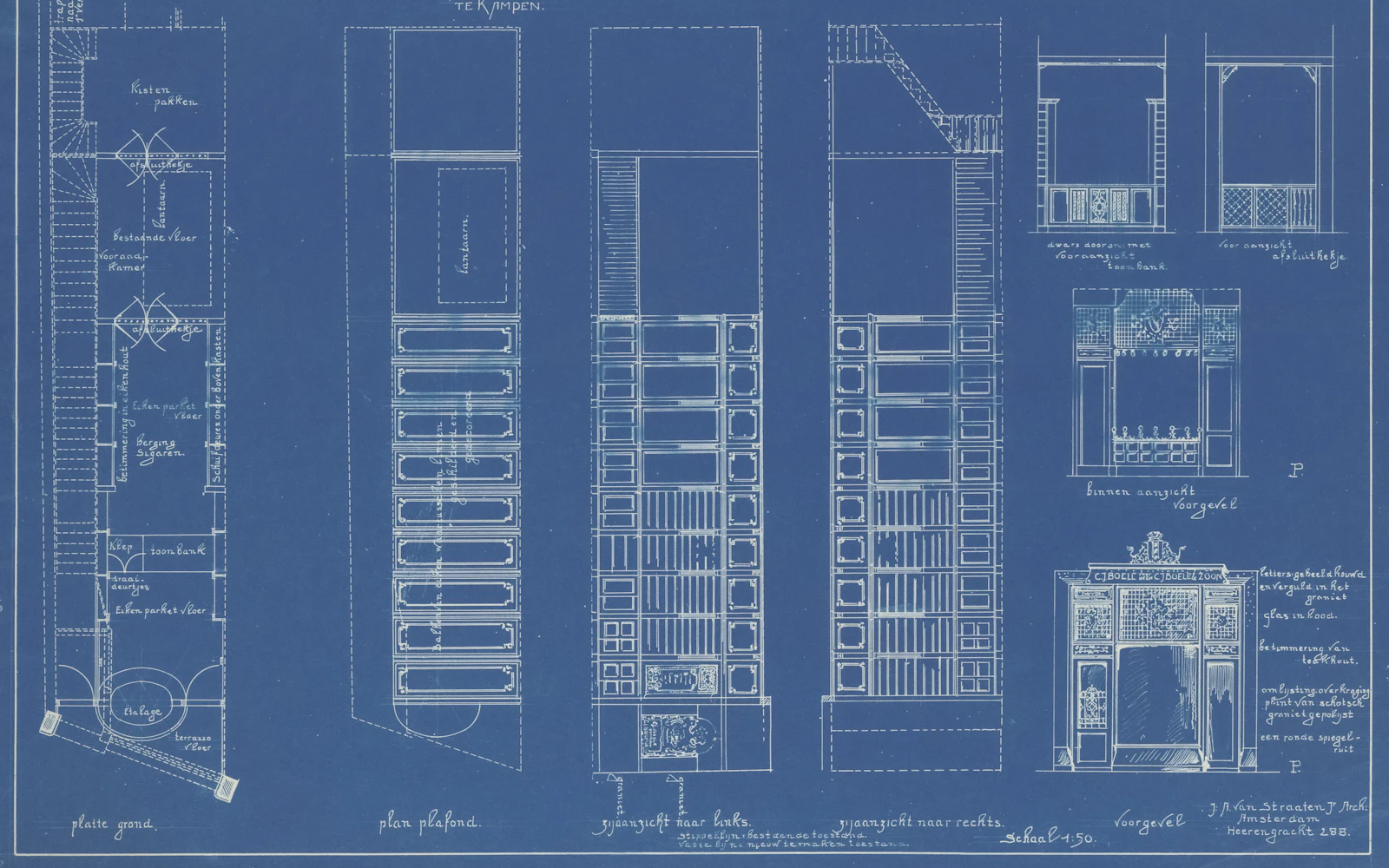
The Blueprint style looks like a technical drawing on a drafting table, with centre lines, construction marks, a dimension line and small dots at the control points. It fits engineering, developer tools and “how it works” pages.
Sketch: hand-drawn and human
The Sketch style looks like marker ink over pencil: loose strokes that cross at the corners, a little overshoot, and light shading on one side. Great for education, workshops, wikis and early-stage ideas.
Gothic: cathedral craft
The Gothic style is the dramatic one in this family: carved limestone and stained glass in ruby, sapphire, gold and emerald, set in dark lead, with pointed arches and rose windows. Think fantasy games, book covers and Halloween campaigns.
Which icon styles feel retro or graphic?
These three bring back looks from design history: 1970s patches, Bauhaus posters and early video games.
- Retro: warm 70s vibes, with chunky outlines, sunset-striped fills and a hard offset shadow, like a vintage patch.
- Bauhaus: tiny compositions of circles, arches, half discs and pills in red, yellow, blue and black, inspired by the famous German art school.
- Pixel: hand-tuned 16-bit pixel art with crisp one-pixel outlines, a shaded body and a highlight pixel, like a sprite from an old console game.
Best for: event posters, music, gaming and playful brands.
Which icon styles are cute and playful?
The biggest family. These six are soft, colourful and happy, made for kids’ products, classrooms, wellness apps and social posts.
- Kawaii: chubby pastel shapes with a soft thick outline and a tiny blushing face. “Kawaii” is Japanese for cute.
- Sticker: die-cut vinyl stickers in candy colours, with bold ink outlines, a puffy white border, a soft drop shadow and a sparkle or two.
- Plush: stuffed toys sewn from felt, with puffy panels, running stitches, buttons and embroidered details.
- Pastel: soft colour fields in lavender, peach, mint, baby blue, butter and blush, with gentle depth. The calmest of the cute styles.
- Anime: crisp tapered ink lines and flat cel colour with one hard shadow, bright shine and the odd sparkle, in sky blue, sakura pink and warm gold.
- Coquette: ballet-pink romance: blush satin objects tied with red bows, pearls, lace and delicate gold.
Why should creative styles be used at 32px or larger?
Creative styles have extra details: highlights, hatching, construction lines, stitches, little faces. At large sizes those details are the whole point. At tiny sizes they get squeezed into a few pixels and turn into fuzz. Here is the blueprint style at five sizes:
So the rule is simple: use creative styles at 32px or larger, and keep line, solid or duo for small buttons and controls. The one exception is pixel, which is tuned to stay crisp at 16, 32 and 48px. Our guide to icon sizes goes into more detail.
Which icon style should you use?
Here is a cheat sheet. “Small” means everyday interface sizes like 16 to 24px. “Big” means 32px and up: feature sections, hero banners, slides and posters.
| Style or family | Feels | Best for | Small sizes | Big sizes |
|---|---|---|---|---|
| Line | Calm, modern | Menus, buttons, forms, most apps | Yes | Yes |
| Solid | Bold, clear | Active states, tiny icons, photos | Yes, the best | Yes |
| Duo | Friendly, warm | Dashboards, cards, onboarding | Yes, tint is subtle | Yes |
| Shiny and 3D: gloss, glass, luxe, skeuo | Premium, fresh | Landing pages, feature grids, title slides | Use 32px+ | Yes |
| Printed and hand-made: engrave, blueprint, sketch, gothic | Classic, clever, human | Finance, dev tools, education, storytelling | Use 32px+ | Yes |
| Retro and graphic: retro, bauhaus, pixel | Bold, nostalgic | Events, games, music, creative brands | Pixel only | Yes |
| Cute: kawaii, sticker, plush, pastel, anime, coquette | Happy, soft | Kids, classrooms, wellness, social posts | Use 32px+ | Yes |
Can you mix icon styles on one page?
Yes, with one simple rule: one style per area. An area is a part of the page with one job, like the top menu, a sidebar, a feature section or a footer. Inside each area, keep every icon in the same style, at the same size and the same line thickness.
That means a landing page can use line icons in the navigation, glass icons in the big feature section, and line icons again in the footer. What looks messy is mixing styles inside one row, like a menu where two icons are outlined, one is pixel art and one is a sticker.
Use line icons in the menu and one creative style, say glass or kawaii, in the hero section. Each area has its own clear style, and both come from the same family.
Put a line bell, a solid mail and a sketch calendar next to each other in one toolbar. It looks like three different people made it.
The only common mix inside one area is the line plus solid pattern for normal and active states, which we covered above. For more on keeping things tidy, read how to keep your icons consistent.
Do other icon sets offer these styles?
Most popular icon sets offer some of the everyday styles:
- Heroicons has outline and solid icons at 24px, plus solid sets drawn for 20px and 16px.
- Phosphor offers six weights: Thin, Light, Regular, Bold, Fill and Duotone.
- Material Symbols from Google comes in Outlined, Rounded and Sharp, with adjustable fill and weight.
- Font Awesome includes Solid, Regular and Brands for free, and keeps styles like Light, Thin and Duotone for paid plans.
These are all good sets with more icons than ours. What makes with icons different is the 17 creative styles, all generated from the same drawing as line, solid and duo, so a pixel rocket and a line rocket are truly the same rocket. That is 10,000 SVGs from 500 drawings. If you are comparing options, our round-up of the best free icon libraries lays them side by side, and icon design trends for 2026 shows where the creative looks are heading.
How do you choose a style in three steps?
- 1Start with line
Use line icons for every menu, button and form. It is the safe default that works almost everywhere.
- 2Add solid for “on”
Switch the selected tab, the liked heart or the saved bookmark to solid. Use solid for icons smaller than 20px, too.
- 3Pick one “wow” style for big moments
Choose duo for a friendly product, or one creative style for hero sections, feature grids and slides: shiny for premium, printed for classic, retro for bold, cute for playful. Use it at 32px or larger.
Frequently asked questions
How many icon styles are there?
There is no fixed number, because every icon set defines its own. Most sets offer 1 to 6 looks, usually outline, filled and sometimes duotone or several line weights. with icons has 20: 3 everyday interface styles (line, solid, duo) and 17 creative styles such as gloss, glass, pixel, retro, kawaii and sketch, all rendered from the same 500 drawings, which makes 10,000 SVGs.
What is the difference between outline and filled icons?
Outline (line) icons are drawn with a stroke and have empty insides, so they look light and airy. Filled (solid) icons are coloured-in shapes, so they look heavier and are easier to spot. Many apps use outline for normal buttons and filled for the one that is selected.
Are line icons or solid icons better?
Neither is better in general. Line icons are a calm default for interfaces. Solid icons are easier to read at very small sizes and on busy photos, and they make a great “active” state. Most products use both, in a planned way.
What is a duotone icon?
A duotone (or two-tone) icon uses two colours or two shades of one colour. In with icons, the duo style is the normal outline drawn over a soft tinted fill, and you can change the tint colour.
Can I mix different icon styles on one page?
Yes, as long as each style has its own job. Keep one style per area (for example line in the menu, glass in the hero section). Mixing styles inside one row or menu usually looks messy.
Which icon style is best for presentations?
For slides, bolder styles work well because icons are seen from far away. Solid and duo are safe choices for business decks. Creative styles like gloss, glass, engrave, blueprint or sketch add personality to title slides and feature slides; cute styles like kawaii or sticker suit classrooms and playful brands.
Sources and notes
- with icons styles: all 20
- Heroicons README (outline and solid sets)
- Phosphor Icons README (six weights)
- Google Fonts: Material Symbols guide (fill, weight, grade, optical size)
- Font Awesome plans (which styles are free)
Facts about other icon sets were checked against their official sites in October 2026. Libraries change, so check the links above for the latest numbers.