design basics, explained
Why mixing icon sets looks cheap, and how to fix it in an afternoon
Most people cannot say why a website or slide deck feels a bit off. Very often it is the icons. Here is what makes icons match, a quick audit you can run today, and a calm way to fix it.
- Mixed icons look cheap because every icon set follows its own rules: line thickness, corner shape, size, fill and level of detail. Your eye notices the clash even when you cannot name it.
- Icons look consistent when six things match: stroke width, corners and line ends, grid and padding, fill, visual weight and metaphors.
- Spot problems with a 10-minute audit: screenshot every screen or slide, put all the icons side by side, and squint.
- Fix it by picking one icon family, listing every icon you use, and replacing them one screen at a time in one style, one size and one colour.
- You can still mix styles on purpose: outline for normal, filled for active, and a bolder style for hero sections, as long as they all come from the same family.
On this page 8 sections
Mixing icon sets looks cheap because every set is drawn with its own rules. One uses thin lines, another thick ones. One has round corners, another sharp ones. Put them side by side and the page feels patched together, even if nobody can say exactly why.
The good news: this is one of the easiest design problems to fix. You do not need to be a designer. You need one icon family, a list, and an afternoon. This guide shows you what to look for, how to check your own website or slides in ten minutes, and how to swap everything over without breaking anything.
Why does mixing icon sets look cheap?
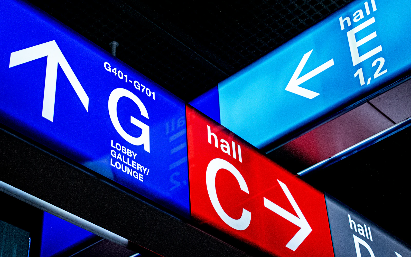
Think of an airport. You walk off a plane, tired, in a country where you cannot read the language, and you still find the toilets, the exit and the baggage hall. That works partly because the signs feel like one family. Each new sign confirms what the last one taught you.
Designers have known this for decades. In 1974 the US Department of Transportation asked the design organisation AIGA to create a set of travel symbols. It started with 34 symbols, grew to 50 in 1979, and you still see versions of them in airports and stations today. They were designed together, with the same thick shapes, the same simple people and the same proportions, so they read as one system.
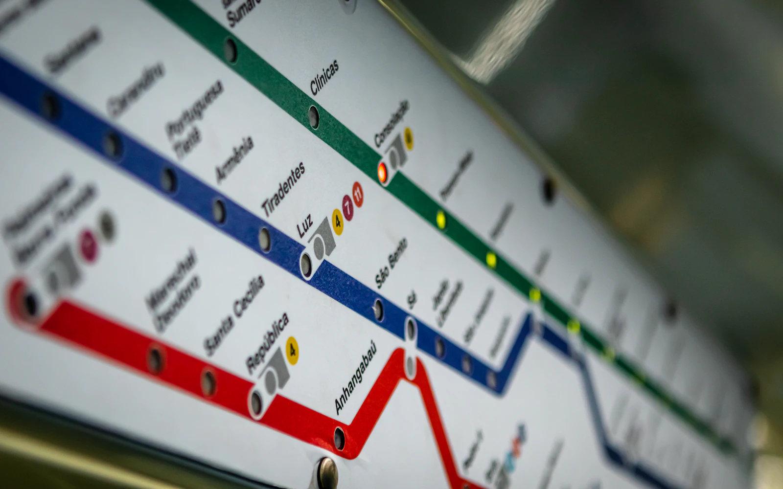
Your website, app or deck is a small airport. Every icon is a sign. When the signs come from five different places, each one speaks with a slightly different accent. Visitors feel the noise, trust the page a little less, and have to work a little harder to read it. That is the “cheap” feeling.
Consistent icons are not about looking fancy. They are about not making people think.
What makes icons look consistent?
Six things decide whether icons feel like one family. You can check every one of them with your own eyes, no tools needed.
| What to check | Looks consistent when… | Looks mixed when… |
|---|---|---|
| Stroke width | Every outline is the same thickness | Some lines are thin and some are chunky |
| Corners and line ends | All corners are equally rounded (or all sharp) | A round-cornered bell sits next to a sharp-cornered folder |
| Grid and padding | Icons fill the same box and look the same size | One icon looks tiny and another touches the edges |
| Fill | All outline, or all filled, by a clear rule | Outline and filled icons are mixed at random |
| Visual weight | Every icon looks equally “dark” from a distance | A busy, detailed icon shouts next to a simple one |
| Metaphors | One idea always uses one picture | “Delete” is a bin here and a cross over there |
1. Stroke width
Stroke width is the thickness of the lines in an outline icon. It is the number one giveaway. For example, Heroicons outline icons use a 1.5px stroke, while Tabler and Feather use 2px. That sounds tiny, but 2px is a third thicker than 1.5px, and at 24px your eye picks it up instantly. The with icons line style uses 1.75px everywhere, on all 500 icons.
2. Corners and line ends
Lines can end flat or round, and corners can be sharp or soft. Neither is better. Mixing them is the problem, because round shapes feel friendly and sharp ones feel technical, so the page cannot decide what mood it is in.
3. Grid and padding
Many popular icon sets are drawn on a 24 × 24 grid, a tiny square of 24 dots across. Each set leaves a different amount of empty space around the drawing. So two “24px” icons from different sets can look like different sizes. If you keep resizing icons by hand to make them line up, that is the cause.
4. Fill
Outline icons are drawings made of lines. Filled (solid) icons are coloured-in shapes. Both are great. Mixing them with no rule makes a row of buttons look uneven, because filled icons look heavier and grab attention.
5. Visual weight
Squint at a row of icons. Does one look like a dark blob while the others look light? That icon has more “visual weight”, usually because it has more detail or more filled areas. Consistent sets balance this on purpose, so a simple circle icon and a busy calendar icon feel about equally dark.
6. Metaphors
A metaphor is the picture chosen for an idea. Consistency here means the same idea always gets the same picture. If “settings” is a gear in the menu and a set of sliders on the profile page, people wonder if those are two different things. We go deeper into this in how to pick the right icon.
How do I spot mixed icons? A 10-minute audit
Before you change anything, find out how bad it really is. This audit works for a website, an app, a slide deck or a printed brochure.
- 1Screenshot everything
Take a screenshot of every page, screen or slide that has icons. Ten to twenty is usually enough for a small site or deck.
- 2Put every icon on one board
Crop the icons out and paste them side by side on one page, slide or whiteboard. Seeing them all together is the whole trick.
- 3Do the squint test
Lean back and squint. Icons that look darker, bigger or blurrier than the rest are your first suspects.
- 4Check the six things
Go through stroke, corners, size, fill, weight and metaphors. Circle anything that breaks the pattern.
- 5Find the duplicates
Look for one idea drawn two ways (two different bins, two different gears). Note which one you want to keep.
- 6Count your sources
Write down where each icon came from. If the answer is more than one set, you have found the root cause.

How do I fix mixed icons in an afternoon?
Here is the calm, boring, reliable way. It works whether you are editing a WordPress site, a Canva deck or an app.
- 1Pick one icon family
Choose a set that covers the icons you need. For everyday business and interface icons, with icons has 500 icons in 20 matching styles, free under the MIT licence.
- 2Make a list
Write down every icon you use and what it means: “bin, removes an item”, “house, goes to the start page”. A simple spreadsheet is perfect.
- 3Find each match
Search the new family for each meaning. On withicons.com you can type everyday words: “bin” finds trash, “gear” finds settings, “house” finds home.
- 4Choose one style per area
For example line icons in the menu and buttons, and a bolder style in the big feature section. Write the rule down.
- 5Set one size and one colour
Pick a size per area (24px is a safe default for menus and buttons) and use your text colour or one brand colour.
- 6Swap one screen at a time
Replace all icons on one page or slide, check it, then move on. Never leave a page half old, half new.
- 7Check at real size
Look at the result at normal zoom, on a phone, and in dark mode if you have one. Small problems show up at small sizes.
- 1
- icon family
- 1
- style per area
- 1
- size per area
- 1
- colour rule
If you work in slides, our guide to icons in presentations walks through PowerPoint, Google Slides and Keynote. On a website, how to add icons to a website covers the copy-and-paste options.
Can I ever mix icon styles on purpose?
Yes. The goal is not “one look forever”. The goal is that every difference has a reason. Three mixes work well:
- Outline for normal, filled for active. The selected tab in a menu uses the filled version of the same icon. People read it as “you are here”.
- A calm style for the interface, a bold one for marketing. Line icons in the app, glossy or hand-drawn icons in the hero section of the landing page.
- Different styles in different places. Duo icons on a friendly dashboard, kawaii or sticker icons on a kids’ worksheet. Each area stays consistent inside itself.
This only works when every style comes from the same drawings. That is the idea behind with icons: each icon is drawn once and rendered into 20 styles (three everyday interface styles and 17 creative ones, from glass and pixel art to retro and luxe gold), so the house is the same house whether it is a thin outline or a glossy illustration. Read more in icon styles explained.
Different moods, same shape, so they still feel like one family.
| Mix | Works? | Why |
|---|---|---|
| Line + solid of the same icon for inactive and active states | Yes | Clear rule, same shape |
| Line icons in the app, gloss icons on the landing page | Yes | Different areas, same family |
| Two outline sets with different stroke widths in one menu | No | The line thickness clashes |
| A creative style at 16px inside a button | No | Detailed styles need 32px or more |
| One borrowed icon from another set, carefully resized | Sometimes | Fine as a stopgap if stroke and corners match closely |
What if the icon I need is missing?
Every set has gaps. Before you borrow from another set, try these in order:
- Search for the idea, not the object. No “piggy bank”? Try “savings” and you may find a wallet or coins icon that says the same thing.
- Use a broader icon plus a label. A generic document icon with the words “Tax form” is clearer than a perfect but odd-looking icon.
- Drop the icon. Not every list item needs one. A plain text link beats a mismatched picture.
- Borrow carefully. If you must, match the stroke width, corner style and size by eye, and use it in one place only.
Pick one family, write down a style rule per area (“line in the menu, solid for the active tab”), and use the same picture for the same idea everywhere.
Grab each icon from a different website because it looked nice on its own. Every icon may be pretty, but together they look like a ransom note.
The bottom line
Icons are tiny, but they appear on every screen, so small differences add up to a big feeling. Match six things (stroke, corners, grid, fill, weight and metaphors), run the ten-minute audit, then swap to one family, one screen at a time. Your site or deck will look calmer and more professional, and you will never again spend twenty minutes nudging an icon one pixel to the left.
Frequently asked questions
Is it bad to use icons from different icon sets?
It is not forbidden, but it usually shows. Different sets use different line weights, corner shapes and sizes, so a menu built from three sets looks patched together. If you must mix, keep each set in its own area, and match size and colour as closely as you can.
How do I make icons look consistent?
Use one icon family, one style per area (for example line icons in the menu), one size per area (for example 24px) and one colour. Then check that the same idea always uses the same icon, so “delete” is never a bin on one screen and a cross on another.
What stroke width should icons have?
There is no single right number, but all icons on one screen should share it. Popular sets use between 1.5px and 2px at 24px. with icons line style uses 1.75px. What matters most is that the number never changes inside one design.
Can I mix outline and filled icons?
Yes, as a rule rather than by accident. A common pattern is outline icons for normal tabs and the filled version of the same icon for the selected tab. Mixing them randomly in one row looks messy.
How long does it take to replace the icons on a small website?
For a typical small site or a 20-slide deck, an afternoon is realistic: an hour to list every icon, an hour or two to find matches in one family, and the rest to swap them in and check each page.
Sources and notes
- DOT pictograms (Wikipedia)
- AIGA Symbol Signs
- Heroicons (outline icons with a 1.5 stroke)
- Tabler Icons (24 × 24 grid, 2px stroke)
- Feather icons (24 × 24 grid, 2px stroke)
Facts about other icon sets were checked against their official sites in October 2026. Libraries change, so check the links above for the latest numbers.