14 design basicss
Icon design, the basics
The ideas behind good icons, explained without jargon: styles, sizes, SVG vs PNG, accessibility, consistency, picking the right symbol and the trends of 2026.

What is an icon library?
An icon library is a set of matching icons with names, file formats and a licence. Learn what is inside one, free vs paid options and how to choose and use one.
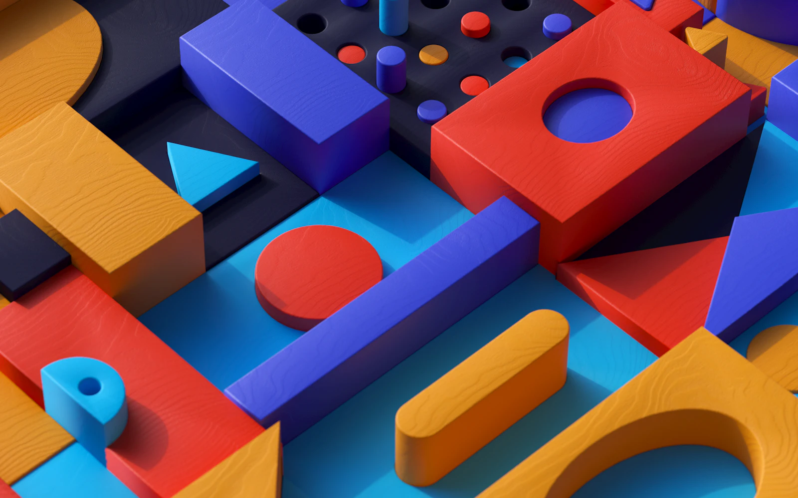
3D icons vs flat icons
Flat or 3D icons? Use flat icons for buttons and menus, 3D icons for heroes, slides and marketing at 32px+. A decision table, file sizes and history.

Icon design glossary
Plain-English definitions of 44 icon design terms: glyph, pictogram, SVG, viewBox, stroke, keyline, duotone, touch target, aria-label, MIT and CC BY.
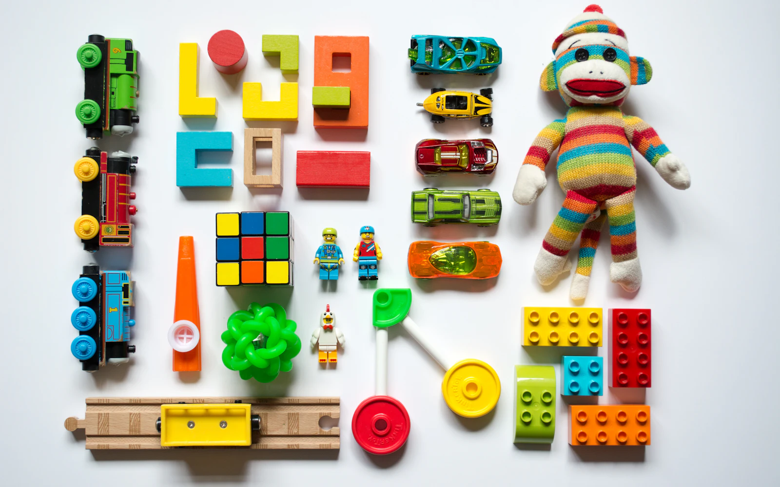
Cute and playful icon styles
Kawaii, sticker, pixel, retro, pastel and more: what each cute icon style looks like, where it works (kids, games, social, slides) and where to avoid it.

Icons in dark mode
How icons behave in dark mode: why they look bolder, how currentColor makes them follow the theme, contrast checks, which styles hold up and why PNGs vanish.

Animated icons: help or hurt?
When animated icons help and when they hurt: SVG, Lottie and GIF in plain words, WCAG motion rules, reduced motion, speed tips, and moving icons in slides and email.
App icon vs UI icon
An app icon represents a whole app on a home screen or store; UI icons are the small symbols inside it. Sizes, shapes, formats, favicons and common mistakes.
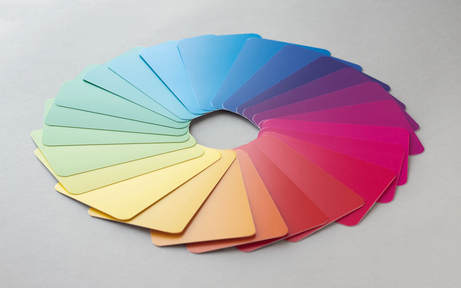
Icon styles explained
A picture-first guide to icon styles: line, solid and duotone for interfaces, plus 17 creative styles from glass and pixel to kawaii. What each is for.

SVG vs PNG icons
SVG or PNG for icons? A plain-English guide to sharpness, file size and colour, plus a clear table for websites, PowerPoint, Google Slides, Canva, Word and email.
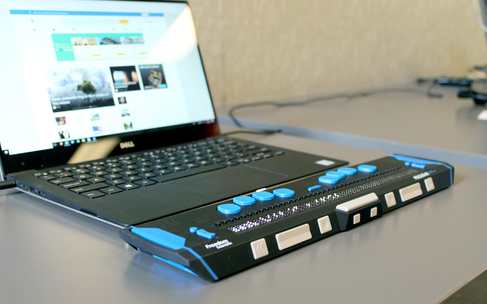
Accessible icons, made simple
A friendly guide to accessible icons: text labels, names for icon-only buttons, decorative icons, 3:1 contrast, tap target sizes and not relying on colour alone.
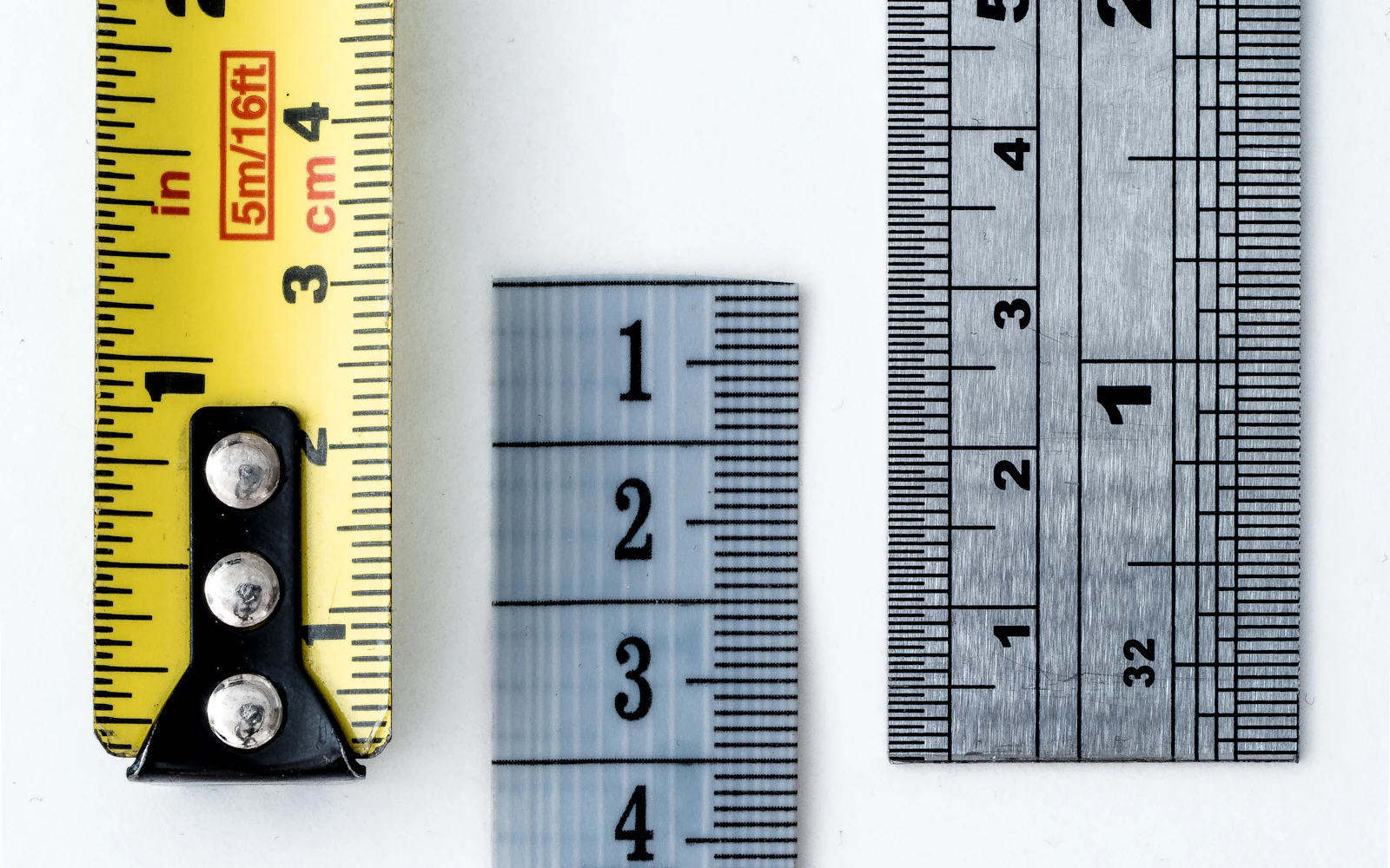
What size should icons be?
A simple guide to icon sizes: 16, 20, 24, 32 and 48 px, matching icons to text, tap targets (WCAG, Apple, Android), and what size PNG to use for slides and print.
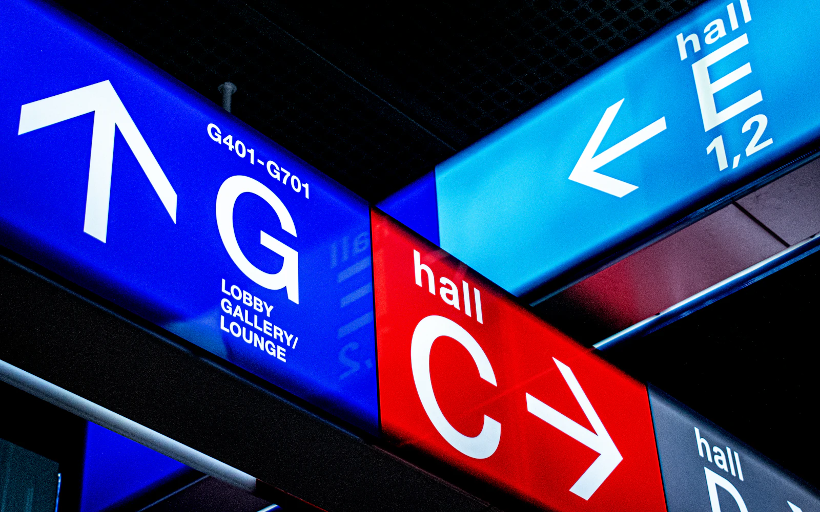
Why mixing icon sets looks cheap
Mixed icon sets make a site or deck feel cheap. Learn what makes icons consistent, run a 10-minute audit, and replace mismatched icons in an afternoon.

How to pick the right icon
Choose icons people understand: common mix-ups (save, settings, share, favourites, menu), when to add a text label, cultural traps, and a 5-person test.

Icon design trends for 2026
The icon design trends shaping 2026: frosted glass, tactile 3D and skeuomorphism, pixel and retro nostalgia, kawaii cuteness, Bauhaus geometry and more.