design basics, explained
How to pick the right icon: meaning, labels and common mix-ups
An icon is a tiny promise about what happens when you click. Here is how to choose one people read correctly, when to add words, and the mix-ups that trip up even big apps.
- The right icon is the one people read correctly in about a second. Pick the most familiar picture, not the most clever one.
- Add a text label to almost every icon. Usability researchers at Nielsen Norman Group found that only a few icons, such as home, print and the magnifying glass for search, are close to universal.
- Watch the classic mix-ups: gear (settings) vs sliders (adjust this view), heart (like) vs star (rate or favourite) vs bookmark (save for later), bell (notifications) vs inbox (messages).
- Meanings change across countries and platforms: a tick can mean “wrong” in some school systems, and iPhone and Android use different share icons.
- Test with five people: show the icon, ask what it does, and fix anything that makes them hesitate.

On this page 8 sections
The right icon is the one people understand without thinking. Choose the most familiar picture for the job, add a short text label unless the icon is truly universal, and check it with five real people. That is most of the secret.
The rest is knowing where people get confused. Some icons look obvious to the person who chose them and mean something completely different to everyone else. This guide covers the classic mix-ups, when words beat pictures, the cultural traps, and a test you can run over coffee. Every example uses real icons from with icons, so you can grab the good ones as you go.
What makes an icon the right icon?
A good icon passes three quick checks:
- It is familiar. People have seen this picture used this way before, in other apps and websites. Familiar beats clever every time.
- It matches what happens. Clicking a trash can should delete something, not archive it. If the result surprises people, the icon was wrong.
- It fits its neighbours. The same idea uses the same picture everywhere, and every icon looks like it belongs to the same family.
Nielsen Norman Group, a research firm that has studied how people use websites for decades, found that only a handful of icons are close to universally understood. Their examples are the house for home, the printer for print, and the magnifying glass for search. Almost everything else needs help from a word.
They also suggest a handy rule of thumb: if you need more than about five seconds to think of an icon for something, an icon probably cannot say it alone. Use a word instead, or a word with the icon.
Which icons do people mix up most?
These pairs cause the most confusion. For each one, here is what people usually expect.
Save: is the floppy disk still OK?
Yes. Hardly anyone has used a floppy disk in years, but the icon itself has been learned through software, so it still reads as “save”. The bigger question is whether you need it. If your app or doc saves automatically, show a small “Saved” message instead. And do not confuse save with download: save keeps changes here, download puts a copy on your device.
Settings: gear or sliders?
A gear means “settings for the whole app or account”. Sliders mean “adjust what I am looking at right now”, like brightness, filters or display options. A funnel means “filter this list”. Using sliders for account settings, or a gear for a filter panel, sends people to the wrong place.
Share: why does it look different on every phone?
Because there is no single standard. Apple uses a box with an arrow pointing up. Android and many websites use three dots joined by lines. People tend to look for the one their own phone uses. The with icons share icon is the three connected dots. If most of your visitors use iPhones, add the word “Share” next to it, so nobody has to guess.
Favourites: heart, star or bookmark?
These three swap meanings from site to site, which is exactly why people hesitate. A famous example: in November 2015 Twitter replaced its star “favourite” button with a heart “like” button, saying the star could be confusing, especially to newcomers. Many users complained, which shows how strongly people attach meaning to these little shapes.
A simple rule that works for most products: heart for “I like this”, star for ratings or a favourites list, bookmark for “save it to read later”.
Notifications: bell or inbox?
A bell says “something happened that you should know about”. An inbox says “here are items waiting for you to deal with”. An envelope says “email”. A speech bubble says “chat or comments”. Using a bell for messages makes people miss them, because they expect alerts, not conversations.
The hamburger menu: three lines, many questions
The three-line icon (people call it a “hamburger” because it looks like a bun and a patty) usually opens the main menu. It saves space, but it also hides your links. In a 2016 study, Nielsen Norman Group measured a drop of more than 20% in how easily people found content when the main navigation was hidden, compared with visible navigation. The effect was bigger on desktop than on phones.
Use it on small screens. On larger ones, show your main links. And remember its cousins: three dots (horizontal or vertical) usually mean “more actions for this item”, not “main menu”.
| If you mean… | Use | Avoid |
|---|---|---|
| Keep my changes | save (floppy disk) | A download arrow |
| App or account settings | settings (gear) | Sliders |
| Filter this list | filter (funnel) | A gear |
| I like this | heart | A thumbs-up for international audiences |
| Rate it, or add to favourites | star | A heart if you already use hearts for likes |
| Read it later | bookmark | A star |
| New alerts | bell | An envelope |
| Delete | trash | A cross, which often means close |
When should an icon have a text label?
Short answer: nearly always. A label turns a guess into certainty, and it helps people using screen readers, people in a hurry, and people who simply think differently from you.
| Situation | Label needed? | Why |
|---|---|---|
| Main navigation (menu, sidebar, tab bar) | Yes, always visible | People need to know where each link goes before they click |
| Unusual or product-specific actions | Yes | No one has learned your custom meaning yet |
| Very familiar icons in a tight toolbar (close, search, play) | Tooltip is OK | Add a tooltip and an accessible name for screen readers |
| Decorative icons next to a heading | No | The heading already says it; hide the icon from screen readers |
Labels also matter for accessibility. An icon-only button needs a name that screen readers can announce, like “Delete row”. Our guide to accessible icons explains how in plain English.
Put a short word next to the icon (“Share”, “Filters”, “Saved”). Keep the label visible, not hidden behind a hover.
Assume your icon is obvious because you chose it. You have seen it a hundred times; your visitor has seen it once.
Do icons mean the same thing in every country?
No, and this catches out many teams. A few real examples:
- The tick (check mark). In English-speaking countries it means correct. In Swedish and Norwegian schools a tick can mark an answer as wrong, in Finnish it can stand for “wrong”, and in Japan a circle usually means correct.
- Thumbs-up. Friendly in many places, but an insult in Iran. For a global product, a heart or the word “Like” is safer.
- Money. A dollar sign says “money” to Americans and “dollars, not my currency” to many others. A wallet, coins or banknote icon is more neutral.
- Hand gestures and mailboxes. Hand signs carry local meanings, and the classic American mailbox with a flag looks unfamiliar in much of the world.
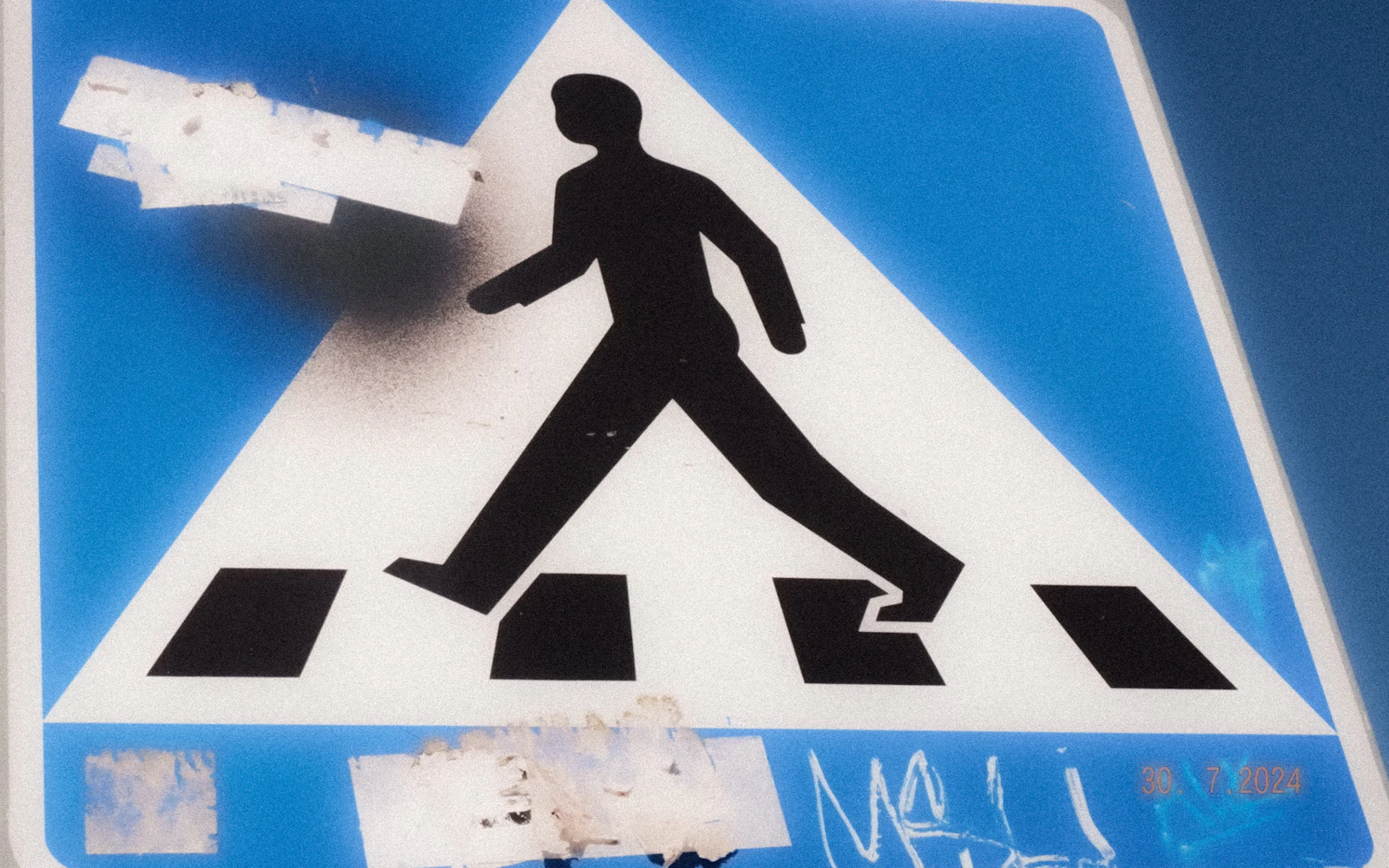
If your audience is international, prefer simple, everyday objects, add labels, and ask one or two people from each key market to look at your icons.
How do you test an icon with five people?
You do not need a lab. In 2000, usability expert Jakob Nielsen showed that small tests with about five people uncover most of the problems in a design (his model put it at around 85%), and that several small rounds beat one big one. Here is a version you can run with friends or colleagues in fifteen minutes.
- 1Show the icon alone
No label, no context. Ask: “What do you think this does?” Write down their exact words.
- 2Show it in context
Now show the real screen or slide. Ask the same question. Context often fixes small doubts.
- 3Give a task
Ask them to do something, like “save this to read later”. Watch where they click first.
- 4Note every pause
A second of hesitation counts. If two or more people pause or guess wrong, the icon needs a label or a swap.
- 5Fix and repeat
Change one thing and test with a new group of five. Two quick rounds beat one long meeting.

How with icons helps you find the right one
Searching an icon library can feel like guessing the designer’s vocabulary. Is it “trash”, “bin” or “delete”? On withicons.com you can type the everyday word you have in mind and the search understands it:
- “bin” or “delete” finds trash
- “gear” or “cog” finds settings
- “house” finds home
- “floppy” finds save
- “hamburger” finds menu
Every icon page also has an “Ask AI” button with an “Is this the right icon?” option. It opens your AI assistant (Claude, ChatGPT, Gemini and others) with a ready-made brief, so you get an honest view on how people will read the icon, whether it needs a label, and better options from the library. More on that in how to get great icons from AI assistants.
Familiar beats clever. A label beats a guess. Five people beat your own opinion.
The bottom line
Picking the right icon is less about drawing and more about listening. Use the picture people already expect, keep one meaning per icon, add a word whenever there is any doubt, and test with five fresh pairs of eyes. Then keep those choices consistent across your whole product, which we cover in why mixing icon sets looks cheap.
Frequently asked questions
Should icons always have text labels?
Almost always. A label removes all doubt and costs a few words. The exceptions are a handful of very familiar icons (home, search, close, play) in tight spaces, and even then they need a tooltip and an accessible name for screen readers.
Is the floppy disk still the right icon for save?
Yes, in most cases. Few people use floppy disks any more, but the icon itself is so widely learned from software that it still reads as “save”. If your app saves automatically, you may not need a save icon at all.
Should I use a heart or a star for favourites?
Use a heart for “I like this” and a star for ratings or a personal favourites list. If people save something to come back to later, a bookmark is clearer than either. Whatever you choose, use it the same way everywhere.
Is the hamburger menu icon bad?
Not bad, but it hides things. Research from Nielsen Norman Group found that hiding the main navigation behind a menu icon made content harder to discover, especially on desktop. Use it on small screens, and show the main links on larger ones.
How do I test if an icon is clear?
Show it to five people who have not seen your design, without a label, and ask what they think it does. Then show it in context and ask them to complete a task. If two or more hesitate or guess wrong, pick a different icon or add a label.
What is the best icon for settings?
A gear (cog) is the most widely recognised settings icon. Use sliders only for adjusting the current view, such as filters or display options.
Sources and notes
- Nielsen Norman Group: Icon Usability
- Nielsen Norman Group: Hamburger Menus and Hidden Navigation Hurt UX Metrics (2016)
- Nielsen Norman Group: Why You Only Need to Test with 5 Users (Jakob Nielsen, 2000)
- Share icon (Wikipedia)
- Fast Company: Why isn’t there a standard share icon?
- Slate: Twitter’s favorite button is now the like button, and the star is a heart (November 2015)
- NPR: Users complain after Twitter changes its “favorite” icon to a heart (November 2015)
- Check mark (Wikipedia)
- Thumb signal (Wikipedia)
Facts about other icon sets were checked against their official sites in October 2026. Libraries change, so check the links above for the latest numbers.