design basics, explained
How to design an icon on a 24 px grid
The grid, the four keylines, one stroke weight and a few rules for corners and spacing. Then how to name, organise and export your icons in Figma today, with the way we draw every with icons icon as the worked example.
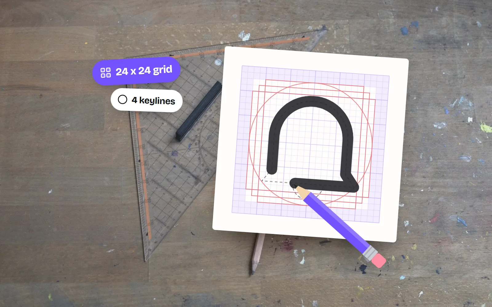
- Start with a 24 x 24 frame and keep the drawing inside the 20 x 20 live area, so 2 px of padding on every side.
- Fit each silhouette to a keyline: a 20 px circle, an 18 px square, a 16 x 20 portrait or a 20 x 16 landscape rectangle. Circles get more room because they look smaller.
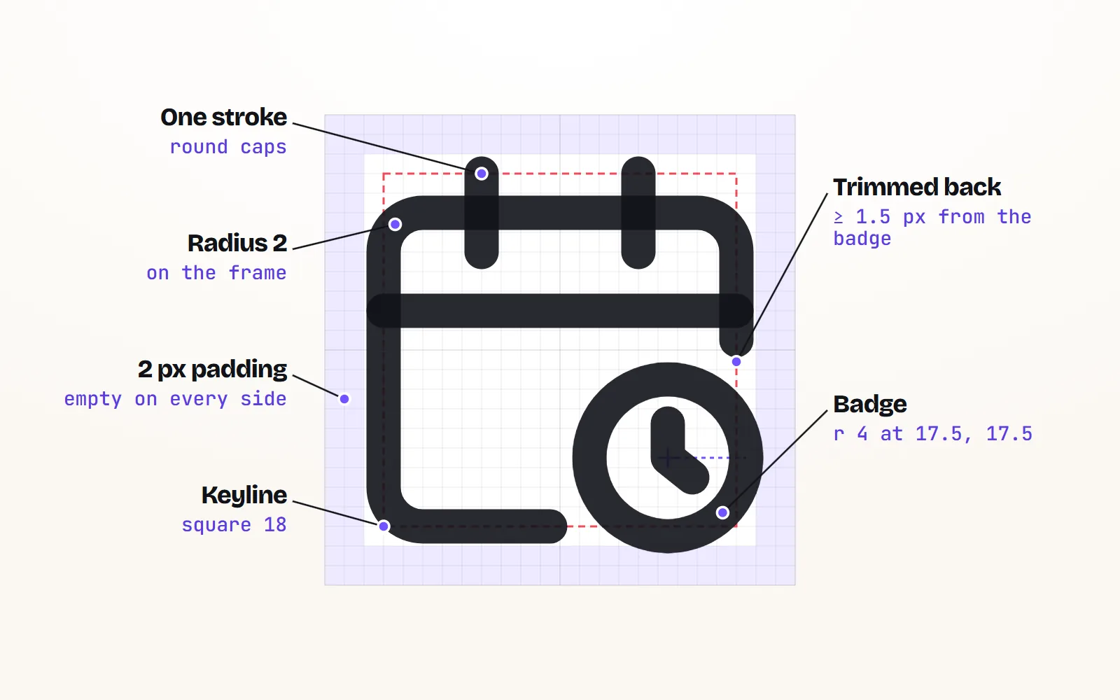
- One stroke weight, one corner radius: for example 2 px strokes with round caps, radius 2 on containers, 2 px of white between parallel lines, points snapped to whole or half pixels.
- Name icons for what they show in kebab-case (
trash, notdelete-button-v2) and keep the guesses (bin, delete, remove) as aliases. - Keep strokes live in your source and in exported SVGs for code. Outlining them turns lines into shapes, and stroke-width settings in code stop working.
On this page 13 sections
To design an icon, draw it on a 24 x 24 grid, keep it inside the 20 x 20 live area (2 px of padding all round), and fit its outline to one of four keylines: a 20 px circle, an 18 px square, a 16 x 20 tall rectangle or a 20 x 16 wide one. Use one stroke weight and one corner radius for the whole set, snap points to whole or half pixels, name it for what it shows, and keep the strokes live when you export.
That is how we draw all 1000 with icons icons, so our own rules are the worked example. Each icon is drawn once on the 24 grid and our code turns it into 34 styles (34,000 SVGs), so the geometry has to be clean.
Why do icons use a 24 px grid?
24 px is the size most apps and websites show icons at next to text, and it scales cleanly to 12 and 48. It is big enough for detail and small enough that every pixel counts. Our icon sizes guide covers which size to use where.
What are keylines, and which one should my icon use?
Keylines are guide shapes inside the grid. Each one says how big a certain kind of silhouette may be. They exist for optical balance: a circle and a square of the same width do not look the same size, because the circle has less ink in its corners. So the circle gets a little more room than the square, and the result looks even.
| Keyline | Size on the 24 grid | Use it for | with icons examples |
|---|---|---|---|
| Circle | 20 px across, centred at 12, 12 | Round objects and circle badges | check-circle, settings |
| Square | 18 x 18 (3 to 21) | Boxy objects and containers | calendar, check-square |
| Portrait | 16 x 20 (4 to 20 across, 2 to 22 down) | Tall things | file, smartphone |
| Landscape | 20 x 16 (2 to 22 across, 4 to 20 down) | Wide things | monitor, battery |
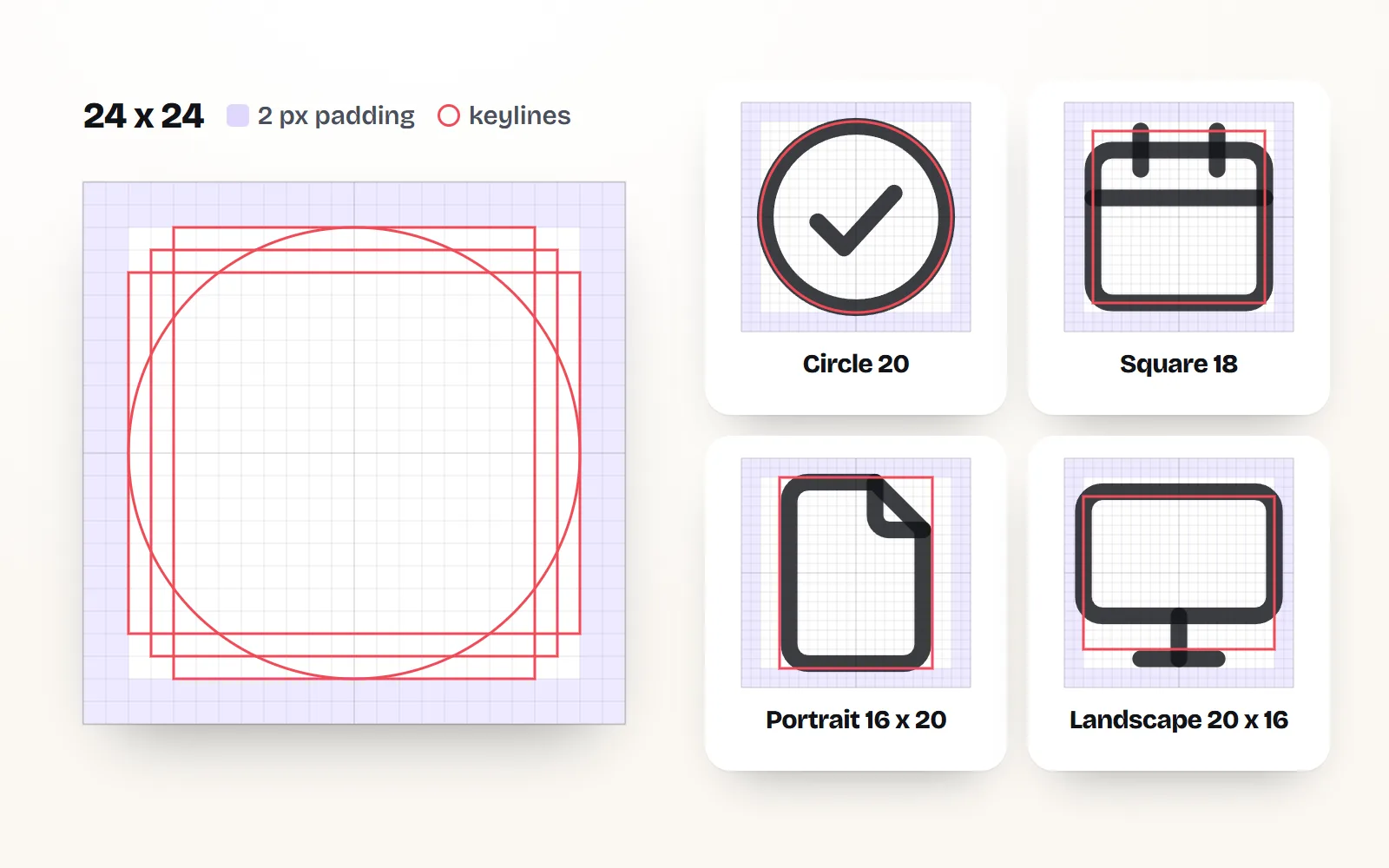
Pick the keyline your silhouette fits and use the same one for related icons, so a row of them lines up.
How much padding should an icon have?
Leave 2 px empty on every side, so the drawing lives inside a 20 x 20 square from 2 to 22. Round forms may touch that edge. Square forms usually stay a pixel further in, from 3 to 21, for the same optical reason as the keylines. The padding lets an icon sit next to text without looking cramped, and keeps strokes from being cut off at the edge.
What stroke weight should icons have?
Choose one weight and use it everywhere. Our skeletons are drawn for a 2 px stroke with round caps and round joins, and the Line style renders them at 1.75 px for a slightly lighter look.
- Spacing: keep at least 2 px of white between parallel strokes, so their centre lines sit 4 px or more apart. Closer lines merge at 16 px.
- Density: 1 to 6 paths is typical, and never more than four parallel lines. Simplify before you add detail.
What corner radius should icons use?
Match it across the set. Our rule: rectangles and containers get a radius of 2, small parts get 1 to 1.5. Mixing sharp and round corners is the fastest way to make a set look assembled from different places. Our post on making icons look consistent goes deeper.
How do I snap an icon to the pixel grid?
Put every end point and corner on a whole or half pixel (12, 12.5, 13). Figma’s icon grid tutorial sets the layout grid to 1 px and the small nudge to 0.5 for the same reason. Edges on pixel boundaries look crisp; edges at 12.37 look soft.
Snap points to 0.5, check the icon at its real size (16 and 24 px) on light and dark backgrounds, and compare it beside four or five finished icons.
Judge an icon only at 800% zoom. Almost everything looks fine huge; small sizes are where blur and crowding show up.
How do I make a whole set look like one family?
Reuse parts. We keep a short list of shared shapes with exact coordinates (the document with its folded corner, the folder, the bell, the cloud, the containers, the check mark), and a new icon starts from them. That is why our file icons look like siblings:
Modifiers follow rules too. A badge (plus, check, lock) sits in a 4 px radius circle in the bottom right, centred near 17.5, 17.5, and the base icon is trimmed back to leave a gap. An "off" icon uses one diagonal slash from 3, 3 to 21, 21 with the drawing cut back on both sides.
How should I name and organise icons in a design system?
Name icons for what they show, in lowercase words joined by hyphens: trash, arrow-right, file-pdf, bell-off. A name like delete describes one use; the same bin also means "remove". Put the object first and the modifier after, so related icons sort together.
Then keep the words people will guess as aliases. Our trash answers to bin, delete, garbage and remove. In Figma, put those words in the component description. In code, use the exact same names, so a designer and a developer never translate between two lists.
Group icons into categories (we use 33, such as navigation, files and communication). And treat a rename as a breaking change: keep the old name working as an alias.
How do I set up icon components in Figma today?
- 1Build the grid once
A 24 x 24 frame with a 1 px layout grid, the padding and the four keylines, saved as a component. Figma’s own tutorial walks through it.
- 2One component per icon
Each icon is a 24 x 24 component named like the code (
arrow-right), with its strokes kept as centred, live strokes and its vector layer set to scale with the frame. - 3Swap icons, don’t detach
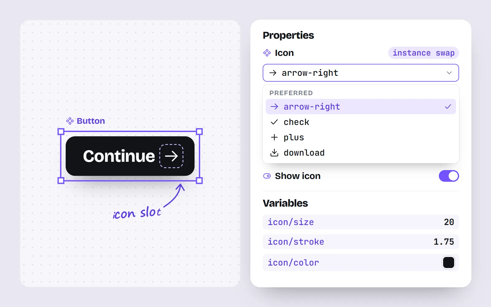
In a button or menu item, make the icon an instance swap property and add preferred instances, so people pick from a short, relevant list. A boolean property can show or hide the icon.
- 4Put sizes and colours in variables
Figma’s number variables can be bound to width and height, corner radius and stroke weight; colour variables to strokes and fills. A 16, 20 and 24 px size scale and an icon colour then live in one place.
- 5Write the description
Add the aliases and a one-line meaning to each component’s description.
Would rather not draw the basics yourself? Our Figma guide shows how to paste any of our icons into Figma as editable vectors, and the best Figma icon libraries compares the sets that ship as Figma components.
Should I outline strokes before exporting SVG icons?
For icons that will be used in code: no. Outlining turns each line into a filled shape. The icon looks identical, but a developer can no longer make the lines thinner or thicker, because there is no line left, only a shape. Here is that setting in our React package:
import { Search } from '@withicons/react'

<Search size={20} strokeWidth={1.5} />
Two Figma details to know. SVG only understands strokes centred on the path, so use centre strokes; Figma’s export settings say inside and outside strokes need its "Simplify stroke" option to come out right. And Figma’s export notes warn that strokes can be exported as fills, so open the exported file and check that it still says stroke-width.
Outlining is right for icon fonts and cutting machines, which need filled shapes. Keep the outlined copy as an export, never as your source.
How do I check an icon before it ships?
- At real size: 16 and 24 px, not just zoomed in.
- On light and dark: thin details that read on white can vanish on a dark background.
- Beside its neighbours: we compare every new icon with home, search, lock and settings for size and ink weight.
Clean geometry pays off twice. Because each of our skeletons follows these rules, it can be redrawn by code in every style, from line to sticker to soft 3D:
The short answer
Draw on a 24 grid with 2 px of padding, fit each shape to a keyline, use one stroke weight and one radius, snap to half pixels, name icons for what they show, and keep strokes live. If you want a head start, all 1000 with icons follow these rules and are free under MIT to study, use or extend. The free icons for Figma page is a good place to start.
Frequently asked questions
What size should I design icons at?
Design interface icons on a 24 x 24 grid with a 20 x 20 live area. 24 px is the most common size in apps and websites, and it scales cleanly to 16, 20, 32 and 48. If your product mostly shows icons at 16 px, draw a separate, simpler 16 px version rather than shrinking the 24.
What are keylines in icon design?
Keylines are guide shapes inside the grid that tell you how big each kind of silhouette should be: a circle, a square, a tall rectangle and a wide rectangle. They are sized so a round icon, a square icon and a tall icon all look equally big, even though their measurements differ.
What stroke width should icons have?
Pick one weight for the whole set and never mix. 2 px at 24 px is common and reads well on screens; 1.5 to 1.75 px looks lighter and more refined. with icons draws its skeletons for a 2 px stroke and renders its line style at 1.75 px.
Should I outline strokes before exporting SVG icons?
Not for icons that will be used in code. Outlined strokes become filled shapes, so a strokeWidth setting can no longer change them. Keep strokes live and centred. Outline only for tools that need filled shapes, such as cutting machines or icon fonts.
How should I name icons in a design system?
Use short, lowercase, hyphenated names that describe what the icon shows (arrow-right, file-pdf, bell-off), and use the same names in Figma and in code. Put the words people might search for instead (bin, delete, remove) into aliases or the component description.
How do I set up icons in Figma now?
Make one component per icon on the 24 grid, then use an instance swap property wherever an icon sits inside another component, like a button, with preferred instances to keep the list short. Number variables can hold sizes and stroke weights, and colour variables can hold the stroke colour.
Sources and notes
- Figma Learn: Create a reusable icon grid (checked November 2026)
- Figma Learn: Explore component properties (checked November 2026)
- Figma Learn: Apply variables to designs (checked November 2026)
- Figma Learn: Export formats and settings (checked November 2026)
- Figma Plugin API updates, 10 June 2026: Slots GA
- with icons authoring contract (forge/CONTRACT.md, GitHub)
- @withicons/react README (size and strokeWidth props)
Facts about other icon sets were checked against their official sites in November 2026. Libraries change, so check the links above for the latest numbers.