icons in code, the 2026 answer
Do icons need “use client”? Icons in React Server Components
createContext errors, “Functions cannot be passed directly to Client Components”, huge icons on first load and bloated bundles: why icon libraries trip over Server Components, and the fixes that work in Next.js 16.
- Icons do not need
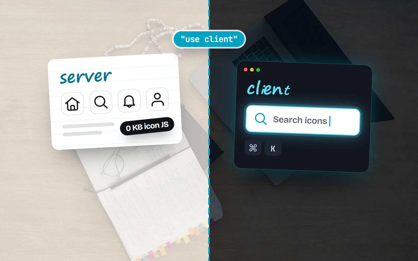
"use client". An icon is just an SVG. A component with no state, effects or context renders in a Server Component and sends no icon JavaScript to the browser. - Trouble starts when a library adds
"use client"or React context (lucide-react 1.x does both; react-icons’IconContextis context). Context providers only work in Client Components, so wrap them in a small client file, as deep in the tree as you can. - “Functions cannot be passed directly to Client Components”: pass the rendered icon (
icon={<Search />}), not the component (icon={Search}). React can send elements across, not functions. - Icons by name: never
import * as Iconsin client code. Use a small explicit map, look the name up on the server, or use a per-icon web component or CSS class. - Measure the production build. Next.js 16 dropped “First Load JS” from
next build; usenext analyze(16.1+) and filter to client modules.
On this page 8 sections
No, icons do not need "use client". An icon is just an SVG, and an icon component with no state, effects or React context renders fine in a Server Component, sending no icon JavaScript to the browser. The errors and the bloat come from four other things: libraries that add context or "use client", passing an icon component to a Client Component, looking icons up by name with import *, and CSS that loads late.
Most answers online were written for Next.js 13 in 2023, and many say “add 'use client' to your root layout”, which turns your whole app into client code. Below is each symptom with the fix that works in Next.js 16 and React 19, checked against the React, Next.js and library docs and source in November 2026. New to importing SVGs in React at all? Start with how to import SVG icons in React and Next.js.
Do icon components need "use client"?
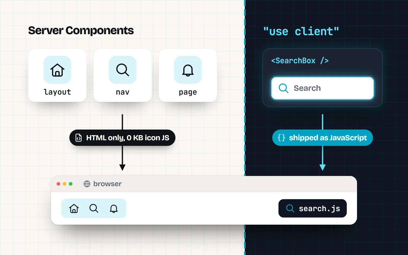
In the Next.js App Router, pages and layouts are Server Components by default: they run on the server, and the browser receives the finished HTML. A file that starts with "use client" becomes a Client Component, and that file plus everything it imports is sent to the browser as JavaScript. The React docs put it plainly: the directive marks “the module and its transitive dependencies as client code”.
So an icon only needs to be client code if it uses client-only features. Drawing an SVG is not one. In a Server Component, an icon costs the browser some markup and zero JavaScript. The same icon imported inside a "use client" file is shipped as code, because everything that file imports is.
Here is how popular libraries behave, from their own source and docs as of November 2026:
| Library | Plain icon in a Server Component | What to know |
|---|---|---|
with icons (@withicons/react) | Yes | Plain forwardRef components, no state, effects or context. Gradient styles call useId, which React supports on the server. |
| lucide-react 1.x | Renders, as client code | Its Icon module starts with "use client" and reads a Lucide context, so icon code ships to the browser. |
| react-icons 5.x | Yes, icons | IconContext is React context: IconContext.Provider needs a Client Component. |
| Phosphor | Use the /ssr entry | Import from @phosphor-icons/react/ssr in Server Components. |
| Font Awesome (SVG core) | Needs its CSS first | Import its stylesheet in the root layout and turn off autoAddCss. |
This is not a ranking. A library that ships as client code still works: Next.js renders it to HTML and then hydrates it. You just pay for its JavaScript. For a fuller comparison, see our React icon library guide.
Why do I get "createContext only works in Client Components"?
Because something in your Server Component tree uses React context, and the Next.js docs are direct about it: “React context is not supported in Server Components.” With icons this usually means a provider that sets a default size or colour for every icon, such as react-icons’ IconContext.Provider placed in app/layout.
A detail explains the odd error some people see. react-icons creates its context with React.createContext && React.createContext(...). In React’s server build, createContext does not exist, so IconContext is undefined: plain icons still render, but IconContext.Provider fails with “Cannot read properties of undefined (reading ‘Provider’)”, exactly what react-icons issue #770 reported in 2023.
Two fixes, both better than marking the root layout as a client file:
- Move the provider into a small client file that starts with
"use client", renders the provider around{children}, and is placed as deep in the tree as possible. That is the pattern the Next.js docs recommend for every provider. - Skip the provider. A default icon size is easy without context: set it with CSS (
svg.icon { width: 1.25rem }) or a two-line wrapper that passessize. With components that inheritcurrentColor, colour already comes from the surrounding text.
How do I fix "Functions cannot be passed directly to Client Components"?
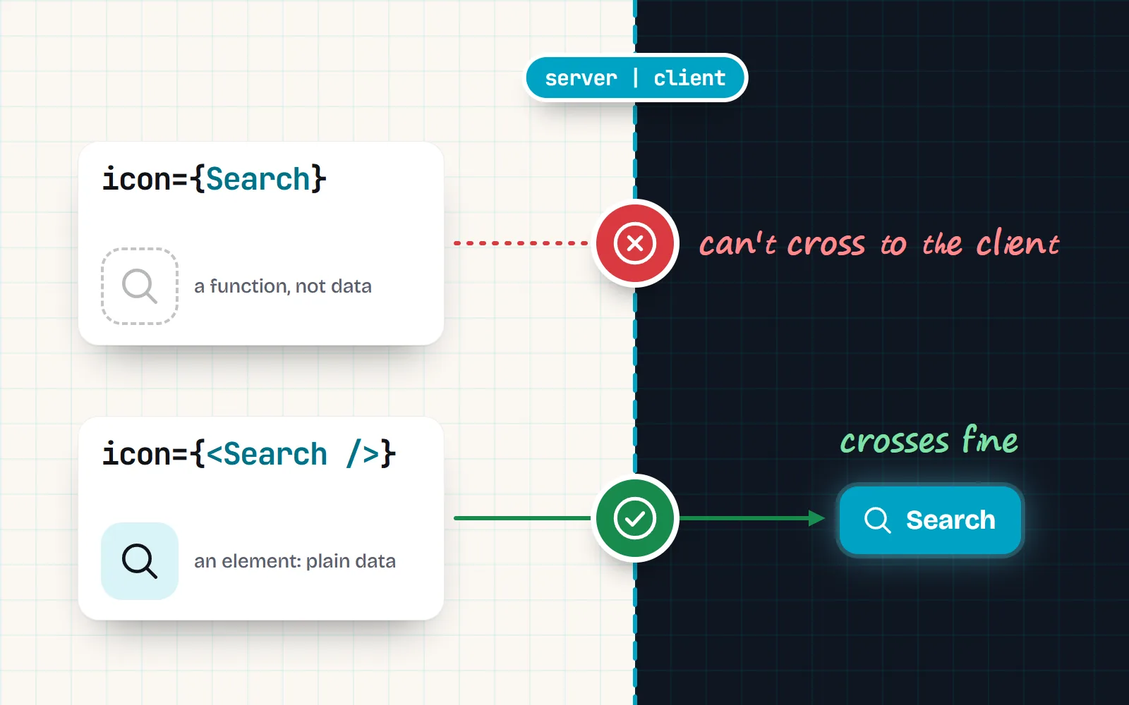
This one appears when a Server Component hands an icon component to a Client Component, for example a button that takes an icon prop. Props that cross from server to client must be serialisable (convertible to data), and the React docs list JSX elements as allowed but plain functions as not. A component is a function. A rendered element is data.
// app/page.jsx (Server Component)
import { Search } from '@withicons/react'
import { IconButton } from './icon-button'   // a 'use client' file

<IconButton icon={Search} label="Search" />        // ✗ passes a function
<IconButton icon={<Search />} label="Search" />    // ✓ passes an element

// icon-button.jsx
'use client'
export function IconButton({ icon, label, ...props }) {
  return <button aria-label={label} {...props}>{icon}</button>
}
If the Client Component must choose the icon itself, pass a string name and map it inside the client file, as below.
How do I render an icon from a string name safely?
Names often come from a CMS field, a database row or a JSON menu. The accepted Stack Overflow answer to this question still does import * as Icons from 'lucide-react' and then Icons[name]. In a Client Component, that ships every icon in the set, because the bundler cannot know which names you will ask for. Better options, from simplest to most open-ended:
- 1A known list? Use an explicit map
Write
const ICONS = { home: Home, search: Search, bell: Bell }and renderICONS[name] ?? null. Only those icons ship, and unknown names render nothing. This also works as an allow-list, so a typo or a hostile value can never load something unexpected. - 2Look the name up on the server
Code that runs only in a Server Component never reaches the browser, so even a large lookup costs the client nothing. Resolve the name in the Server Component and pass the rendered element down.
- 3Truly open-ended names in the browser? Load per icon
Lazy per-icon imports work, with costs that Lucide’s own docs list for its
DynamicIcon: longer builds, one module per icon, more network requests and a possible flash while an icon loads. A web component or CSS class keyed by name avoids the JavaScript per icon.
with icons has two parts built for this. In React, <Icon name="home" /> accepts names and unambiguous aliases (bin finds trash) and renders nothing for unknown names, with a console warning naming the three nearest icons. It renders the line style at once, which means it bundles every line icon plus the alias table (about 145 KB gzipped before minification in version 0.6.0, by our measurement), so keep it for truly dynamic names, and loads any other style on first use inside <Suspense>. Server Components wait for that load and send the finished SVG. In the browser, <with-icon name="home"> from @withicons/web fetches one small file per icon shown (a line icon is typically 161 bytes gzipped, per the package README), and the CSS icon classes do the same with a stylesheet per icon.
Why are my Font Awesome icons huge on first load?
Font Awesome’s SVG core normally adds its own stylesheet to the page at runtime, and that stylesheet is what keeps icons small. Font Awesome’s docs say Next.js manages CSS differently and blocks that step, so icons show up huge without their CSS. Their Next.js instructions fix it in your root layout:
// app/layout.jsx
import '@fortawesome/fontawesome-svg-core/styles.css'
import { config } from '@fortawesome/fontawesome-svg-core'
config.autoAddCss = false
The lesson applies to any icon set that sizes itself with injected CSS: load that CSS with the page. Components that set width and height on the SVG itself (as with icons does, 24 by default) do not have this problem.
How do I measure what icons add to my bundle?
Two traps first. The dev server does not tree-shake like a production build, so its numbers look far worse. And since Next.js 16, next build no longer prints “size” and “First Load JS”: the Next.js team says those figures were inaccurate with Server Components. Here is what to do instead:
- 1Run the bundle analyser
In Next.js 16.1 and later, run
npx next analyze. It opens a treemap of your modules built from Turbopack’s module graph. On webpack builds, use@next/bundle-analyzer. - 2Filter to client modules
Icons that render only in Server Components should not appear in the client view at all. If a whole icon set does, follow its import chain (click the module) to the file that pulled it in.
- 3Look for the usual suspects
import * as, a big name-to-icon object in a client file, an icon picker loaded on every route, or a provider that drags a library into a client boundary. - 4Fix, then compare
npx next analyze --outputwrites the analysis to.next/diagnostics/analyze, so you can keep a copy and compare before and after.
What changed since the old answers?
- 2023: the App Router made Server Components the default, and early answers said to mark the root layout as a client file.
- 21 October 2025, Next.js 16: Turbopack became the default bundler, and the size columns left the build output.
- Next.js 16.1:
next analyzearrived as the Turbopack bundle analyser. - Library side: lucide-react 1.x ships its icons as client code with a context, and Phosphor offers an
/ssrentry. Libraries change, so check the source of the version you install.
Keep icons in Server Components where you can, pass rendered elements across the boundary, map string names through a small allow-list, and measure a production build.
Add "use client" to the root layout to silence an icon error, import * a whole icon set for name lookups, or judge bundle size from the dev server.
If you want icons that are plain server-friendly components, browse the library: all 1000 icons come in 34 styles, starting with the line style for interfaces. Using shadcn/ui? Our shadcn/ui icons guide shows how to swap the icon set.
Frequently asked questions
Do I need "use client" for icons in Next.js?
Not for the icons themselves. An SVG icon component without state, effects or context can render in a Server Component. You only need a client boundary if the library uses context or other client-only features, or if the icon sits inside an interactive component that is already a Client Component.
Why do I get "createContext only works in Client Components" from an icon library?
Because the library, or a provider you added (for example react-icons’ IconContext.Provider), uses React context, and React does not support context in Server Components. Move the provider into a small file that starts with "use client" and wraps only the part of the tree that needs it, or drop the provider and set a default size with a tiny wrapper or CSS.
How do I pass an icon as a prop from a Server Component to a Client Component?
Pass a rendered element: <Button icon={<Search />} />. React can serialise JSX elements across the boundary, but not plain functions, and a component is a function. Inside the Client Component, render the prop with {icon}. The other way is to pass a string name and look it up in a small map on the client.
Why is my icon library making my bundle huge?
Usually because something imports the whole set: import * as Icons, an object of every icon for a dynamic name lookup, or an icon picker loaded on every page. Named imports from a tree-shakable package keep only the icons you use in production. Check with a production build, not the dev server, and look at client modules only.
Why are my Font Awesome icons huge on first load in Next.js?
Font Awesome’s SVG core normally adds its own CSS at runtime, and that CSS is what sizes the icons, but Next.js blocks the step. Its docs for Next.js say to import @fortawesome/fontawesome-svg-core/styles.css in your root layout and set config.autoAddCss = false, so the CSS is there before the icons render.
Can I render an icon from a string in a Server Component?
Yes, and it is cheaper there than anywhere else: code that runs only on the server is not sent to the browser, so the lookup table costs nothing on the client. Still check the name against the icons you allow, and render nothing for unknown names.
Sources and notes
- Next.js docs: Server and Client Components (context providers, third-party components, bundle size; checked November 2026)
- React docs: “use client” (module graph, serialisable props)
- Next.js docs: Optimizing package bundling (next analyze, 16.1+)
- Next.js docs: optimizePackageImports (experimental; packages optimised by default)
- Next.js docs: upgrading to version 16 (size and First Load JS removed from build output)
- lucide-react 1.70.0 Icon source (“use client”, useLucideContext)
- Lucide docs: DynamicIcon caveats
- react-icons 5.7.0 iconContext source (React.createContext)
- react-icons issue #770: IconContext.Provider in a Next.js 13 layout (July 2023)
- Font Awesome docs: using React with Next.js (autoAddCss)
- with icons: @withicons/react README (SSR, Server Components, Icon)
Facts about other icon sets were checked against their official sites in November 2026. Libraries change, so check the links above for the latest numbers.