icons in code, the 2026 answer
How to vertically align an icon with text
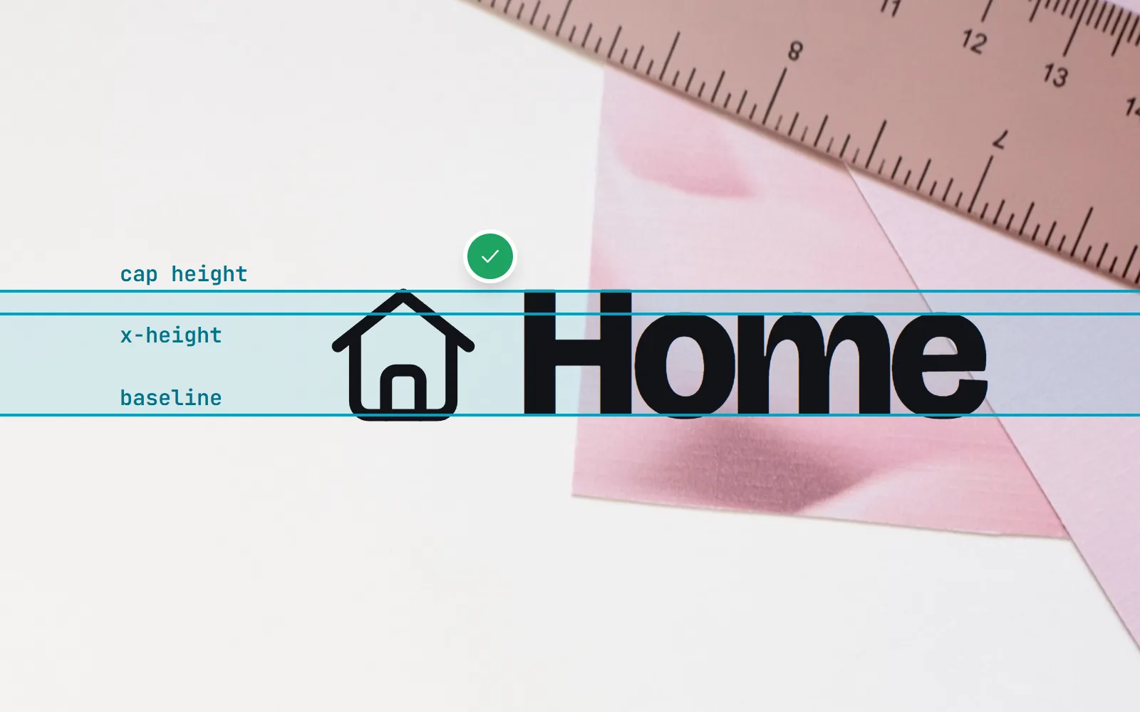
Your icon sits a little too high, or a little too low, and the old answers say “add top: 2px”. Here is what actually works now: flexbox and gap, a 1em icon, -0.125em for running text, and the new CSS text-box for a true optical centre.
- Icon next to a label (buttons, menus, chips)? Put both in a flex row:
display: inline-flex; align-items: center; gap: 0.5em, and size the icon inem. - Icon inside a sentence? Make it
1emsquare and setvertical-align: -0.125em.vertical-align: middlelines up with the lower-case letters, so it often looks slightly off. - New in 2026:
text-box: trim-both cap alphabeticon the label trims the empty space above capitals and below the baseline, so centring looks right. It became Baseline in August 2026, when Firefox 154 shipped it. - A small gap under an icon on its own line is the space kept for letters like g and y. Fix it with
display: blockon the SVG. - Skip magic numbers like
position: relative; top: 2px. They break as soon as the font or size changes.
On this page 9 sections
To vertically align an icon with text, put them in a flex row: display: inline-flex; align-items: center; gap: 0.5em, with the icon sized in em. When the icon sits inside a sentence and you cannot add a wrapper, make it 1em square and nudge it with vertical-align: -0.125em. For a true optical centre, the new CSS text-box: trim-both cap alphabetic trims the label to its capital letters, and it has worked in every major browser since August 2026.
That covers almost every case. Below we explain why icons drift in the first place, which vertical-align values do what, how text-box changes the picture, how to line up icons inside buttons, and how to kill the mystery gap under an SVG. Every example uses real icons from with icons, but the CSS works with any SVG icon set.
Why is my icon not aligned with my text?
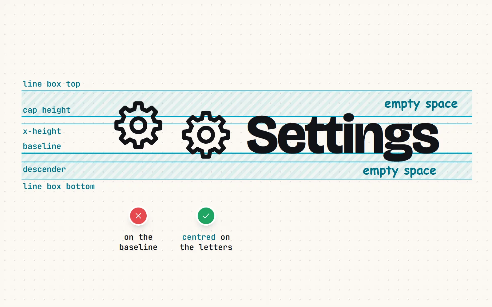
Because an icon and a word are measured differently. An SVG placed in a line of text behaves like a big letter: its bottom edge sits on the baseline, the invisible line letters stand on. But text has extra room around it. Above the capitals there is space for accents and line spacing, and below the baseline there is space for the tails of g, p and y.
So a 1em icon sitting on the baseline pokes up above the capital letters and looks too high. And when you centre the icon on the whole text box, you centre it on the letters plus that invisible padding, which is usually not where the eye puts the middle. Fixing alignment means deciding what “centre” you mean.
How do I centre an icon next to text with flexbox?
This is the answer for buttons, menu items, badges, chips and list rows: anywhere you can wrap the icon and its label in one element.
.with-label {
  display: inline-flex;
  align-items: center;   /* centre the icon and the text on each other */
  gap: 0.5em;            /* space between them, scales with the text */
}
.with-label svg {
  width: 1.25em;
  height: 1.25em;
  flex-shrink: 0;        /* never let a long label squash the icon */
}
<a class="with-label" href="/settings">
<svg viewBox="0 0 24 24" aria-hidden="true">…</svg>
<span>Settings</span>
</a>Three small details make this hold up. gap replaces the old margin on the icon, and works in either direction (icon before or after). Sizing in em means the icon grows with the text, so a large heading and a small caption both stay balanced. And flex-shrink: 0 stops the icon shrinking when the label is long and the row runs out of room.
If your label wraps onto two lines, align-items: center centres the icon on the whole block, which can look odd. Use align-items: flex-start and wrap the icon in a small flex box with height: 1lh (one line height, a unit every major browser has supported since 2023) that centres it, so the icon stays centred on the first line.
Should I use vertical-align: middle or -0.125em?
Inside running text, where an icon sits in a sentence like “Tap the ★ to save”, there is often no wrapper to make into a flex row. Then vertical-align on the icon itself is the tool. The values are easy to mix up:
| Value | What it lines up | How it looks with a 1em icon |
|---|---|---|
baseline (default) | Bottom of the icon on the text baseline | Too high: the icon pokes above the capitals |
middle | Middle of the icon on the baseline plus half the x-height (MDN’s definition) | Close next to lower-case text, a little low next to capitals |
-0.125em | Bottom of the icon one eighth of the font size below the baseline | Balanced in most fonts |
text-bottom | Bottom of the icon on the bottom of the text area | Usually sits low |
top: 2px (with position: relative) | Whatever 2 pixels happened to fix on one screen | Breaks when the font or size changes |
The -0.125em value is a rule of thumb rather than a standard, but a widely shared one: Iconify’s docs recommend it for inline icons, and our own CSS classes use it. Because it is in em, it scales with the text instead of being tied to one size.
.inline-icon {
  width: 1em;
  height: 1em;
  vertical-align: -0.125em;
}
If an icon should match the height of capital letters exactly, size it with the cap unit: height: 1cap. It reads the real cap height from the font you use, and has been Baseline since December 2023.
What is CSS text-box, and does it fix icon alignment?
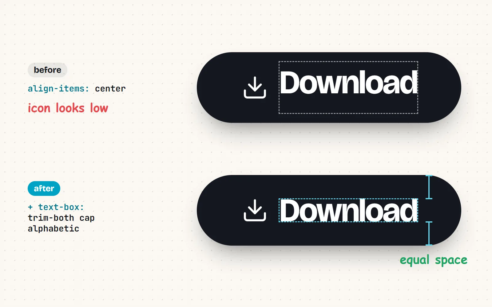
text-box is a newer CSS property that trims the empty space a font keeps above and below its letters. With text-box: trim-both cap alphabetic, the top of the text box moves down to the top of the capital letters, and the bottom moves up to the baseline. What is left is a box exactly as tall as an “H”.
That is exactly what icon alignment needs. Centre an icon on that trimmed box and it centres on the letters people actually see, not on invisible padding. The property applies to block containers and inline boxes, so put it on the label’s own element, not on the flex row:
.with-label { display: inline-flex; align-items: center; gap: 0.5em; }
.with-label > span { text-box: trim-both cap alphabetic; }
Support arrived in steps. Safari 18.2 shipped it in December 2024 and Chrome and Edge 133 in February 2025. Firefox 154 completed the set on 18 August 2026, and MDN now lists text-box as Baseline 2026, newly available. Browsers without it simply ignore the line, and the flexbox centring underneath still works, so it is safe to add today.
- Results depend on the font. The trim reads the font’s own cap-height and baseline data, so check your real typeface.
- Mostly lower-case labels? Try
text-box: trim-both ex alphabetic, which trims to the x-height instead. - It also tidies padding. Trimmed buttons look evenly padded top and bottom, which was the property’s original purpose.
How do I align an icon inside a button?
- 1Make the button a flex row
Set
display: inline-flex; align-items: center; gap: 0.5em;on the button, and keep vertical padding equal top and bottom. - 2Size the icon in em
Use
1.25emfor most buttons andflex-shrink: 0so it keeps its shape. Skip margins:gaphandles the spacing. - 3Wrap the label and trim it
Put the text in a
<span>and addtext-box: trim-both cap alphabeticfor an optical centre in current browsers. - 4Hide the icon from screen readers
With a visible label, the icon is decoration: add
aria-hidden="true". An icon-only button needs anaria-labelinstead.
Centre with flexbox, size the icon in em, space with gap, and let text-box fine-tune the optical centre.
Nudge icons with position: relative; top: 2px, set line-height: 0 on buttons, or add a margin to the icon that only works at one font size.
How big should the button itself be, and how do you label an icon-only one? That is its own question, answered in how big an icon button should be. For the icon sizes that look sharp, see our icon sizes guide.
Why is there a gap below my inline SVG?
This one is not stale, just puzzling. An SVG is inline by default, so it sits on the baseline, and the browser keeps space below for letter tails even when there are no letters. You see a few pixels of empty space under an icon, or a parent that is taller than its icon.
/* an icon on its own: make it a block */
.icon-standalone { display: block; }

/* or keep it inline but stop baseline alignment */
.icon-standalone { vertical-align: middle; }
A flex or grid container fixes it too, because flex items are not aligned on a baseline unless you ask for it. That is one more reason the flex pattern above is the default answer.
How do with icons line up with text?
Our packages do the first steps for you. The CSS classes (<i class="with with-home">) are 1em square with vertical-align: -0.125em built in, and with-lg switches to -0.25em for its larger size. with-fw gives a fixed 1.25em width so icons in a menu line up in a neat column. The React, Vue, Svelte, Angular and Solid components and the <with-icon> web component render plain inline SVG, so they drop straight into the flex pattern above.
<button class="with-label">
  <i class="with with-download"></i>
  <span>Download</span>
</button>
Every one of the 1000 icons is drawn on the same 24 x 24 grid with the same padding, in all 34 styles, so once one icon lines up, they all do. Start with the settings icon or the HTML guide, and if you are placing icons with CSS alone, read SVG icons in CSS.
The short version
Flex row, align-items: center, gap, icon in em: that solves nine cases out of ten. In running text, 1em and vertical-align: -0.125em. For the last pixel of polish, text-box: trim-both cap alphabetic on the label, now that every major browser supports it. And never trust a magic top: 2px.
Frequently asked questions
Why is vertical-align: middle not centring my icon?
Because “middle” does not mean the middle of the text. MDN defines it as lining up the icon’s middle with the baseline plus half the x-height, the height of a lower-case x. Next to capitals and numbers, that sits low. Use a flex row with align-items: center, or vertical-align: -0.125em for a 1em icon in running text.
How do I centre an icon and text inside a button?
Make the button a flex row: display: inline-flex; align-items: center; gap: 0.5em;. Give the icon a size in em and flex-shrink: 0 so it never squashes. For a crisper optical centre, add text-box: trim-both cap alphabetic to the label’s span.
What is text-box-trim in CSS?
It removes the empty space a font keeps above and below its letters. text-box: trim-both cap alphabetic trims the top to the height of capital letters and the bottom to the baseline. MDN lists it as Baseline 2026: Chrome and Edge 133, Safari 18.2 and Firefox 154 (August 2026) support it.
Why is there a gap below my SVG icon?
An inline SVG sits on the text baseline like a letter, and the browser keeps room under the baseline for descenders such as g, p and y. Set display: block on the SVG (or vertical-align: middle), or put it in a flex container, and the gap disappears.
What size should an icon be next to text?
Size it in em so it follows the text: 1em matches the font size, and 1.25em suits most buttons. With 16 px text that gives 16 or 20 px icons. Size in pixels only when the icon must stay fixed whatever the text size.
Sources and notes
- MDN: text-box (Baseline 2026, newly available since August 2026), checked November 2026
- MDN: Firefox 154 release notes (text-box support, 18 August 2026)
- Can I use: text-box-trim (Chrome 133, Safari 18.2, Firefox 154), checked November 2026
- Chrome for Developers: CSS text-box-trim
- MDN: vertical-align (baseline, middle and length values), checked November 2026
- Web platform features explorer: the cap and lh units, checked November 2026
- Iconify docs: inline icons and vertical-align -0.125em
- Stack Overflow: How do you align text with SVG elements? (question 37742099)
Facts about other icon sets were checked against their official sites in November 2026. Libraries change, so check the links above for the latest numbers.